Colour Wheel Art and Design:
As a key element in colour theory, the colour wheel is used traditionally for guidance for colour mixing and colour combination. The first colour wheel was designed by Sir Isaac NewtonIsaac Newton (1642–1727 CE) was an English mathematician, physicist, astronomer, and author who is widely recognized as one of the most influential scientists of all time. His work laid the foundation for classical mechanics and significantly advanced the understanding of light and color. Born in Woolsthorpe, England, Newton made substantial contributions across various fields, but his work in optics and More in 1666 who experimented with prism. His experiments led him to the theory of primary colours, from which all other colours were derived. Newton’s colour wheel evolved over the centuries and has become the basis for the modern colour wheel, which is still widely applied in art and design.
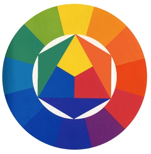
Today’s colour wheel is consists of:
- the primary colour wheel with the three primary colours – red, yellow, and blue.
- the secondary colour wheel with the three secondary colours – green, orange, and purple – which are created when primary colours are mixed.
- the tertiary colour wheel with the six tertiary colours – such as blue-green and red-violet – which are made through mixing primary and secondary colours.
When a line is drawn through the centre of the wheel, the warm colours are separated from cool colours. Warm colours such as reds, oranges, and yellows are usually associated with brightness, energy, and action. Cool colours on the other side such as blues, greens, and purples are generally identified with serenity, calmness, and peace.
Tints, tonesIn color theory, a tone is a version of a color created by adding gray (a mix of black and white) to the original hue. This concept is essential for artists and designers as it allows for a wide range of colors that are neither too dark nor too light, providing versatility in creating depth, mood, and harmony within a More, and shadesIn color theory, a shade is a darker version of a color, created by adding black to the original hue. This concept is essential for artists and designers, as it allows for a range of deeper, more intense tones that can add depth and drama to a composition. Defining Shade A shade results from mixing a pure hue with black. More are variations of the colours on the colour wheel. Tints are hues to which white has been added – for example mixing red and white for a pink. A shade is a hueIn color theory, hue is one of the main properties of a color, defining its dominant wavelength. This characteristic determines whether we perceive a color as red, orange, yellow, green, blue, or violet. Understanding hue is essential for artists, designers, and anyone working with color. Defining Hue • Definition: Hue is the degree to which a color can be described More to into which black has been mixed – for example combining red and black for a burgundy. Finally, a tone is a colour to which grey has been added, making colours appear more subtle and les intense.
Three colour schemes have been established for the sake of combining colours: Complementary, analogous, and triadic schemes.
- Complementary colours are found opposite to each other on the colour wheel, for example, red and green, which will lead to a strong contrast.
- Analogous colours are located next to each other on the colour wheel, for example, red, orange, and yellow. Usually, in a design, one colour will dominate and the others will support with an accent.
- Triadic colours are found when evenly spacing on the colour wheel, for example, hues of red, yellow, and blue. They tend to exude a bright and dynamic effect, creating harmony and contrast simultaneously.
Using the colour schemes is not only helpful for artists when laying out their compositions, but also are widely applied in design, e.g., when choosing artwork for interior design.