Color Palette Generator
Mix and match colors. That’s easier said than done, right? Well, not anymore. Get ready to dive into a pool of endless possibilities with Pigment Pool’s free color paletteA color palette refers to a selection of colors used in design and art. It can set the tone, convey emotions, and highlight key elements. color wheel Types of Color Palettes • Monochromatic: Uses variations in lightness and saturation of a single color. Ideal for creating a harmonious and cohesive look. • Analogous: Combines colors that are next to each More generator. Now you can discover the most radiant color combinations in a jiffy.
Decorating your room and searching for the perfect art piece to complement it? Or perhaps you’re fortunate enough to own a stunning paintingPainting is a fundamental form of visual art that has been practiced for thousands of years. It involves applying pigment to a surface such as canvas, paper, or a wall. Painting can be explored through various styles, techniques, and mediums, each offering unique possibilities for expression and creativity. Historical Background • Ancient Beginnings: The history of painting dates back to More and now wish to harmonize your space with matching wall paint and carpet colors?
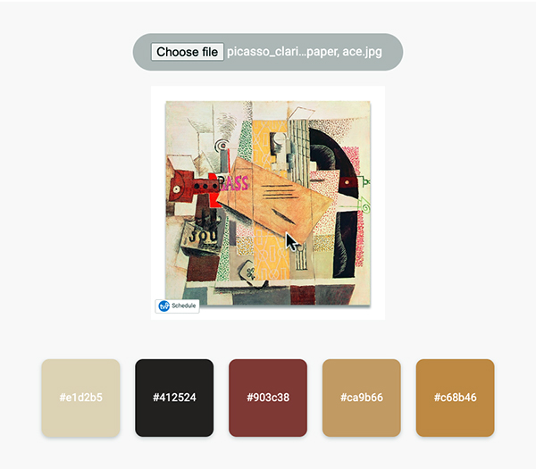
Simply upload a picture of your artwork or any other photo, and voilà! Our generator crafts a color theme from image, offering a palette that sings in harmony. This palette from image hands you five beautifully contrasting colors, complete with hex codes, ensuring a seamless blend of hues.
Forget the frustration of using a color paletteA color palette refers to a selection of colors used in design and art. It can set the tone, convey emotions, and highlight key elements. color wheel Types of Color Palettes • Monochromatic: Uses variations in lightness and saturation of a single color. Ideal for creating a harmonious and cohesive look. • Analogous: Combines colors that are next to each More generator app that crashes at the worst moments or hides the best features behind a paywall. With Pigment Pool, everything you need is at your fingertips, free and accessible. Why not create your own color mixing chart? We’d be honored to serve as your artistic color picker, guiding you through the process of finding the perfect hues for your projects.
Therefore, give it a whirl. Your perfect color combination is just an upload away. Let Pigment Pool be your guide to transforming any space or project with colors that reflect your vision and style.
Here’s what you can do with our tool:
- Finding Color Inspiration: Seeking fresh and unique color ideas for creative projects beyond conventional color mixing chart.
- Designing Websites: Needing a cohesive color paletteA color palette refers to a selection of colors used in design and art. It can set the tone, convey emotions, and highlight key elements. color wheel Types of Color Palettes • Monochromatic: Uses variations in lightness and saturation of a single color. Ideal for creating a harmonious and cohesive look. • Analogous: Combines colors that are next to each More cmyk/hex for a new website or redesign.
- Interior Decorating: Create color theme from image when looking for the perfect color combinations for home decor.
- Graphic Design Projects: Creating visually appealing graphics with harmonious color combinations.
- Branding and Marketing: Developing a brand color paletteA color palette refers to a selection of colors used in design and art. It can set the tone, convey emotions, and highlight key elements. color wheel Types of Color Palettes • Monochromatic: Uses variations in lightness and saturation of a single color. Ideal for creating a harmonious and cohesive look. • Analogous: Combines colors that are next to each More that resonates with their audience.
- Fashion Design: Extract palette from image for exploring color trends for clothing and accessory designs.
- Art Projects: Artists seeking color schemes that convey a certain mood, theme or color theoryColor Theory is a comprehensive framework used to understand and analyze the use and interaction of colors in visual compositions. It serves as a critical guide for artists, designers, and marketers, helping them create harmonious and effective designs. This concept encompasses various principles and elements that dictate how colors are combined, perceived, and utilized. Primary Colors: • The three foundational More; mixing paint colors.
- Photography: Enhancing photo aesthetics with complementary color schemes.
- DIYDIY, or Do It Yourself, refers to the practice of creating, building, or repairing things on your own, without professional help. It encompasses a wide range of activities, from home improvement to crafting and art projects. Benefits of DIY DIY projects offer several advantages: • Cost Savings: You can save money by doing tasks yourself instead of hiring professionals. • More Crafts: Use color paletteA color palette refers to a selection of colors used in design and art. It can set the tone, convey emotions, and highlight key elements. color wheel Types of Color Palettes • Monochromatic: Uses variations in lightness and saturation of a single color. Ideal for creating a harmonious and cohesive look. • Analogous: Combines colors that are next to each More generator from image for selecting color themes for personal craft projects.
- Home Renovation: Selecting paint colors and matching decor elements, e.g. for color combinations in your bedroom
- Digital ArtDigital art refers to a range of artistic works and practices that use digital technology as an essential part of the creative or presentation process. Since the 1970s, various names have been used to describe the process, including computer art and multimedia art. Digital art is itself placed under the larger umbrella term of new media art. The digital art More: Use a color picker and extractor when experimenting with different color palettes in digital artwork.
- Educational Purposes: Understanding and teaching color theoryColor Theory is a comprehensive framework used to understand and analyze the use and interaction of colors in visual compositions. It serves as a critical guide for artists, designers, and marketers, helping them create harmonious and effective designs. This concept encompasses various principles and elements that dictate how colors are combined, perceived, and utilized. Primary Colors: • The three foundational More and design principles, e.g., creating a color paletteA color palette refers to a selection of colors used in design and art. It can set the tone, convey emotions, and highlight key elements. color wheel Types of Color Palettes • Monochromatic: Uses variations in lightness and saturation of a single color. Ideal for creating a harmonious and cohesive look. • Analogous: Combines colors that are next to each More challenge.
- Personal Style Exploration: Understanding color preferences for personal wardrobe choices.
How to Use the Free Color PaletteA color palette refers to a selection of colors used in design and art. It can set the tone, convey emotions, and highlight key elements. color wheel Types of Color Palettes • Monochromatic: Uses variations in lightness and saturation of a single color. Ideal for creating a harmonious and cohesive look. • Analogous: Combines colors that are next to each More Generator
It’s simple and intuitive. Start by selecting the ‘Choose File’ button to upload an image from your device. Once you’ve chosen an image, our tool will automatically process it and display a curated color paletteA color palette refers to a selection of colors used in design and art. It can set the tone, convey emotions, and highlight key elements. color wheel Types of Color Palettes • Monochromatic: Uses variations in lightness and saturation of a single color. Ideal for creating a harmonious and cohesive look. • Analogous: Combines colors that are next to each More derived from the colors in the image. You can then use these colors for inspiration or directly in your projects. The tool also allows you to see the hex codes for each color, making it easy to replicate the colors in digital design platforms or physical projects.
Feeling inspired?
Art Supplies
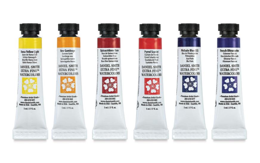
Bring your color paletteA color palette refers to a selection of colors used in design and art. It can set the tone, convey emotions, and highlight key elements. color wheel Types of Color Palettes • Monochromatic: Uses variations in lightness and saturation of a single color. Ideal for creating a harmonious and cohesive look. • Analogous: Combines colors that are next to each More from image to life with premium art suppliesArt supplies are the tools and materials artists use to create their works. They range from basic items like pencils and paper to more specialized equipment like airbrushes and printing presses. Basic Art Supplies • Pencils: Available in various grades, from hard (H) to soft (B). Essential for sketching and detailed drawing. • Erasers: Include kneaded, rubber, and precision erasers. More. Whether you’re paintingPainting is a fundamental form of visual art that has been practiced for thousands of years. It involves applying pigment to a surface such as canvas, paper, or a wall. Painting can be explored through various styles, techniques, and mediums, each offering unique possibilities for expression and creativity. Historical Background • Ancient Beginnings: The history of painting dates back to More, sketchingSketching is a fundamental practice in the art world, involving the creation of quick, loose drawings to capture basic shapes, forms, and ideas. It serves as the backbone for more detailed artworks and helps artists refine their concepts. Essential Sketching Supplies • Pencils: Ranging from hard (H) to soft (B) grades, providing a variety of lines and textures. • Paper: More, or experimenting with mixed mediaMixed media involves combining various art materials and techniques within a single artwork. This approach allows artists to explore diverse textures, effects, and expressions. Basic Components of Mixed Media • Traditional Media: Includes paints, inks, and pencils. • Non-Traditional Media: Items like fabric, metal, and found objects. • Digital Elements: Incorporating digital prints or using software for certain effects. Techniques More, find everything you need to translate your vision into art. Explore Art Supplies


Home Decor
Ready to transform your space? Discover decor items that perfectly complement your new color paletteA color palette refers to a selection of colors used in design and art. It can set the tone, convey emotions, and highlight key elements. color wheel Types of Color Palettes • Monochromatic: Uses variations in lightness and saturation of a single color. Ideal for creating a harmonious and cohesive look. • Analogous: Combines colors that are next to each More from image. From vibrant throw pillows to elegant curtains, let’s create a harmonious look for your home. Get started here.


DIY Projects
“DIYDIY, or Do It Yourself, refers to the practice of creating, building, or repairing things on your own, without professional help. It encompasses a wide range of activities, from home improvement to crafting and art projects. Benefits of DIY DIY projects offer several advantages: • Cost Savings: You can save money by doing tasks yourself instead of hiring professionals. • More enthusiast? Embark on your next creative adventure with the right tools and materials. Whether it’s a home renovation or a crafty endeavor, Home Depot offers all you need to bring your projects to life. Find Supplies at Home Depot.”


Books on Color and Design
Want to dive deeper into the world of color? Enhance your understanding and application of your palette with insightful books on color theoryColor Theory is a comprehensive framework used to understand and analyze the use and interaction of colors in visual compositions. It serves as a critical guide for artists, designers, and marketers, helping them create harmonious and effective designs. This concept encompasses various principles and elements that dictate how colors are combined, perceived, and utilized. Primary Colors: • The three foundational More, design principles, and creative inspiration. We handpicked the three best books on color theoryColor Theory is a comprehensive framework used to understand and analyze the use and interaction of colors in visual compositions. It serves as a critical guide for artists, designers, and marketers, helping them create harmonious and effective designs. This concept encompasses various principles and elements that dictate how colors are combined, perceived, and utilized. Primary Colors: • The three foundational More and design!
200 COLOR PALETTES: Inspiration for Graphic Designers, Illustrators and Artists by EM SANS
The Color Bible Hardcover by Laura Perryman
This article may contain compensated links. Please read Disclaimer for more info. As an Amazon Associate, I earn from qualifying purchases.
FAQ
Where can I find color paletteA color palette refers to a selection of colors used in design and art. It can set the tone, convey emotions, and highlight key elements. color wheel Types of Color Palettes • Monochromatic: Uses variations in lightness and saturation of a single color. Ideal for creating a harmonious and cohesive look. • Analogous: Combines colors that are next to each More inspiration for my art projects?
Color paletteA color palette refers to a selection of colors used in design and art. It can set the tone, convey emotions, and highlight key elements. color wheel Types of Color Palettes • Monochromatic: Uses variations in lightness and saturation of a single color. Ideal for creating a harmonious and cohesive look. • Analogous: Combines colors that are next to each More inspiration can be found in nature, architecture, fashion, and even everyday objects. Exploring diverse sources can spark new ideas for color combinations and color schemes, enriching your artistic endeavors. Websites and tools that offer a color theme from image feature can also provide instant inspiration, translating any photo into a potential color paletteA color palette refers to a selection of colors used in design and art. It can set the tone, convey emotions, and highlight key elements. color wheel Types of Color Palettes • Monochromatic: Uses variations in lightness and saturation of a single color. Ideal for creating a harmonious and cohesive look. • Analogous: Combines colors that are next to each More for your project.
How does color theoryColor Theory is a comprehensive framework used to understand and analyze the use and interaction of colors in visual compositions. It serves as a critical guide for artists, designers, and marketers, helping them create harmonious and effective designs. This concept encompasses various principles and elements that dictate how colors are combined, perceived, and utilized. Primary Colors: • The three foundational More influence color schemes?
Color theoryColor Theory is a comprehensive framework used to understand and analyze the use and interaction of colors in visual compositions. It serves as a critical guide for artists, designers, and marketers, helping them create harmonious and effective designs. This concept encompasses various principles and elements that dictate how colors are combined, perceived, and utilized. Primary Colors: • The three foundational More provides a foundational understanding of how colors interact, influence mood, and convey messages, which is critical in developing effective color schemes for any project. It guides the selection of color combinations that achieve color harmony, ensuring a visually appealing and cohesive look. Applying color theoryColor Theory is a comprehensive framework used to understand and analyze the use and interaction of colors in visual compositions. It serves as a critical guide for artists, designers, and marketers, helping them create harmonious and effective designs. This concept encompasses various principles and elements that dictate how colors are combined, perceived, and utilized. Primary Colors: • The three foundational More can enhance the impact and effectiveness of your designs, from color paletteA color palette refers to a selection of colors used in design and art. It can set the tone, convey emotions, and highlight key elements. color wheel Types of Color Palettes • Monochromatic: Uses variations in lightness and saturation of a single color. Ideal for creating a harmonious and cohesive look. • Analogous: Combines colors that are next to each More design to bold color paletteA color palette refers to a selection of colors used in design and art. It can set the tone, convey emotions, and highlight key elements. color wheel Types of Color Palettes • Monochromatic: Uses variations in lightness and saturation of a single color. Ideal for creating a harmonious and cohesive look. • Analogous: Combines colors that are next to each More wall art.
How do I create a unique brand color paletteA color palette refers to a selection of colors used in design and art. It can set the tone, convey emotions, and highlight key elements. color wheel Types of Color Palettes • Monochromatic: Uses variations in lightness and saturation of a single color. Ideal for creating a harmonious and cohesive look. • Analogous: Combines colors that are next to each More?
Creating a unique brand color paletteA color palette refers to a selection of colors used in design and art. It can set the tone, convey emotions, and highlight key elements. color wheel Types of Color Palettes • Monochromatic: Uses variations in lightness and saturation of a single color. Ideal for creating a harmonious and cohesive look. • Analogous: Combines colors that are next to each More involves selecting colors that align with your brand’s identity, values, and the emotions you wish to evoke. Consider incorporating modern color palettes that stand out, such as a bold color paletteA color palette refers to a selection of colors used in design and art. It can set the tone, convey emotions, and highlight key elements. color wheel Types of Color Palettes • Monochromatic: Uses variations in lightness and saturation of a single color. Ideal for creating a harmonious and cohesive look. • Analogous: Combines colors that are next to each More pink or a vibrant color paletteA color palette refers to a selection of colors used in design and art. It can set the tone, convey emotions, and highlight key elements. color wheel Types of Color Palettes • Monochromatic: Uses variations in lightness and saturation of a single color. Ideal for creating a harmonious and cohesive look. • Analogous: Combines colors that are next to each More blue, to make a memorable impact. A well-chosen brand color paletteA color palette refers to a selection of colors used in design and art. It can set the tone, convey emotions, and highlight key elements. color wheel Types of Color Palettes • Monochromatic: Uses variations in lightness and saturation of a single color. Ideal for creating a harmonious and cohesive look. • Analogous: Combines colors that are next to each More can enhance brand recognition and connect emotionally with your audience.
What should I consider in color paletteA color palette refers to a selection of colors used in design and art. It can set the tone, convey emotions, and highlight key elements. color wheel Types of Color Palettes • Monochromatic: Uses variations in lightness and saturation of a single color. Ideal for creating a harmonious and cohesive look. • Analogous: Combines colors that are next to each More design for websites?
In color paletteA color palette refers to a selection of colors used in design and art. It can set the tone, convey emotions, and highlight key elements. color wheel Types of Color Palettes • Monochromatic: Uses variations in lightness and saturation of a single color. Ideal for creating a harmonious and cohesive look. • Analogous: Combines colors that are next to each More design for websites, it’s essential to ensure color harmony and readability, selecting a palette that complements the brand while offering a user-friendly experience. Modern color palettes with clear contrasts and accessible hues can improve navigation and engagement. A thoughtful color paletteA color palette refers to a selection of colors used in design and art. It can set the tone, convey emotions, and highlight key elements. color wheel Types of Color Palettes • Monochromatic: Uses variations in lightness and saturation of a single color. Ideal for creating a harmonious and cohesive look. • Analogous: Combines colors that are next to each More design can significantly enhance the aesthetic and functionality of a website.
What are some trendy color combos for branding?
For branding, trendy color combos often include modern color palettes that can make a brand stand out, such as combining a color paletteA color palette refers to a selection of colors used in design and art. It can set the tone, convey emotions, and highlight key elements. color wheel Types of Color Palettes • Monochromatic: Uses variations in lightness and saturation of a single color. Ideal for creating a harmonious and cohesive look. • Analogous: Combines colors that are next to each More blue with a color paletteA color palette refers to a selection of colors used in design and art. It can set the tone, convey emotions, and highlight key elements. color wheel Types of Color Palettes • Monochromatic: Uses variations in lightness and saturation of a single color. Ideal for creating a harmonious and cohesive look. • Analogous: Combines colors that are next to each More pink for a fresh, vibrant look. Brand color paletteA color palette refers to a selection of colors used in design and art. It can set the tone, convey emotions, and highlight key elements. color wheel Types of Color Palettes • Monochromatic: Uses variations in lightness and saturation of a single color. Ideal for creating a harmonious and cohesive look. • Analogous: Combines colors that are next to each More decisions should reflect the brand’s identity and the emotions it aims to evoke in its audience. Choosing the right color combos can significantly impact a brand’s perception and success.
How do I create harmonious color combinations?
Harmonious color combinations can be achieved by applying principles from color theoryColor Theory is a comprehensive framework used to understand and analyze the use and interaction of colors in visual compositions. It serves as a critical guide for artists, designers, and marketers, helping them create harmonious and effective designs. This concept encompasses various principles and elements that dictate how colors are combined, perceived, and utilized. Primary Colors: • The three foundational More and using the color wheel to select complementary or analogous colors. This approach ensures color harmony, enhancing the aesthetic appeal of your design or project. Whether you’re working on color paletteA color palette refers to a selection of colors used in design and art. It can set the tone, convey emotions, and highlight key elements. color wheel Types of Color Palettes • Monochromatic: Uses variations in lightness and saturation of a single color. Ideal for creating a harmonious and cohesive look. • Analogous: Combines colors that are next to each More design or bold color paletteA color palette refers to a selection of colors used in design and art. It can set the tone, convey emotions, and highlight key elements. color wheel Types of Color Palettes • Monochromatic: Uses variations in lightness and saturation of a single color. Ideal for creating a harmonious and cohesive look. • Analogous: Combines colors that are next to each More wall art, understanding these fundamentals is key.
How can I incorporate a blue color paletteA color palette refers to a selection of colors used in design and art. It can set the tone, convey emotions, and highlight key elements. color wheel Types of Color Palettes • Monochromatic: Uses variations in lightness and saturation of a single color. Ideal for creating a harmonious and cohesive look. • Analogous: Combines colors that are next to each More into home decor?
Incorporating a blue color paletteA color palette refers to a selection of colors used in design and art. It can set the tone, convey emotions, and highlight key elements. color wheel Types of Color Palettes • Monochromatic: Uses variations in lightness and saturation of a single color. Ideal for creating a harmonious and cohesive look. • Analogous: Combines colors that are next to each More into home decor can create a serene and calming environment, especially when paired with color paletteA color palette refers to a selection of colors used in design and art. It can set the tone, convey emotions, and highlight key elements. color wheel Types of Color Palettes • Monochromatic: Uses variations in lightness and saturation of a single color. Ideal for creating a harmonious and cohesive look. • Analogous: Combines colors that are next to each More earth tone accents for balance. A teal color paletteA color palette refers to a selection of colors used in design and art. It can set the tone, convey emotions, and highlight key elements. color wheel Types of Color Palettes • Monochromatic: Uses variations in lightness and saturation of a single color. Ideal for creating a harmonious and cohesive look. • Analogous: Combines colors that are next to each More can add a modern twist, while maintaining color harmony throughout the space. Using various shadesIn color theory, a shade is a darker version of a color, created by adding black to the original hue. This concept is essential for artists and designers, as it allows for a range of deeper, more intense tones that can add depth and drama to a composition. Defining Shade A shade results from mixing a pure hue with black. More of blue can transform any room into a tranquil retreat.
What tips can you give for using a teal color paletteA color palette refers to a selection of colors used in design and art. It can set the tone, convey emotions, and highlight key elements. color wheel Types of Color Palettes • Monochromatic: Uses variations in lightness and saturation of a single color. Ideal for creating a harmonious and cohesive look. • Analogous: Combines colors that are next to each More in digital artDigital art refers to a range of artistic works and practices that use digital technology as an essential part of the creative or presentation process. Since the 1970s, various names have been used to describe the process, including computer art and multimedia art. Digital art is itself placed under the larger umbrella term of new media art. The digital art More?
Using a teal color paletteA color palette refers to a selection of colors used in design and art. It can set the tone, convey emotions, and highlight key elements. color wheel Types of Color Palettes • Monochromatic: Uses variations in lightness and saturation of a single color. Ideal for creating a harmonious and cohesive look. • Analogous: Combines colors that are next to each More in digital artDigital art refers to a range of artistic works and practices that use digital technology as an essential part of the creative or presentation process. Since the 1970s, various names have been used to describe the process, including computer art and multimedia art. Digital art is itself placed under the larger umbrella term of new media art. The digital art More can add depth and sophistication, especially when paired with color paletteA color palette refers to a selection of colors used in design and art. It can set the tone, convey emotions, and highlight key elements. color wheel Types of Color Palettes • Monochromatic: Uses variations in lightness and saturation of a single color. Ideal for creating a harmonious and cohesive look. • Analogous: Combines colors that are next to each More earth tonesIn color theory, a tone is a version of a color created by adding gray (a mix of black and white) to the original hue. This concept is essential for artists and designers as it allows for a wide range of colors that are neither too dark nor too light, providing versatility in creating depth, mood, and harmony within a More for a grounded, yet modern look. Achieving color harmony with a teal color paletteA color palette refers to a selection of colors used in design and art. It can set the tone, convey emotions, and highlight key elements. color wheel Types of Color Palettes • Monochromatic: Uses variations in lightness and saturation of a single color. Ideal for creating a harmonious and cohesive look. • Analogous: Combines colors that are next to each More involves balancing its coolness with warmer hues or complementary colors. This can enhance visual appeal and convey the desired mood or theme in your digital artwork.
Can you recommend an earth tone color paletteA color palette refers to a selection of colors used in design and art. It can set the tone, convey emotions, and highlight key elements. color wheel Types of Color Palettes • Monochromatic: Uses variations in lightness and saturation of a single color. Ideal for creating a harmonious and cohesive look. • Analogous: Combines colors that are next to each More for cozy interiors?
An earth tone color paletteA color palette refers to a selection of colors used in design and art. It can set the tone, convey emotions, and highlight key elements. color wheel Types of Color Palettes • Monochromatic: Uses variations in lightness and saturation of a single color. Ideal for creating a harmonious and cohesive look. • Analogous: Combines colors that are next to each More, featuring hues such as warm browns, soft tans, and muted greens, can create a cozy and inviting atmosphere in interiors. This palette, rooted in color theoryColor Theory is a comprehensive framework used to understand and analyze the use and interaction of colors in visual compositions. It serves as a critical guide for artists, designers, and marketers, helping them create harmonious and effective designs. This concept encompasses various principles and elements that dictate how colors are combined, perceived, and utilized. Primary Colors: • The three foundational More, emphasizes natural colors that evoke a sense of comfort and tranquility. Incorporating an earth tone color paletteA color palette refers to a selection of colors used in design and art. It can set the tone, convey emotions, and highlight key elements. color wheel Types of Color Palettes • Monochromatic: Uses variations in lightness and saturation of a single color. Ideal for creating a harmonious and cohesive look. • Analogous: Combines colors that are next to each More into your home decor can transform your space into a warm, welcoming haven.
What are examples of pastel color paletteA color palette refers to a selection of colors used in design and art. It can set the tone, convey emotions, and highlight key elements. color wheel Types of Color Palettes • Monochromatic: Uses variations in lightness and saturation of a single color. Ideal for creating a harmonious and cohesive look. • Analogous: Combines colors that are next to each More for spring collections?
For spring collections, a pastel color paletteA color palette refers to a selection of colors used in design and art. It can set the tone, convey emotions, and highlight key elements. color wheel Types of Color Palettes • Monochromatic: Uses variations in lightness and saturation of a single color. Ideal for creating a harmonious and cohesive look. • Analogous: Combines colors that are next to each More can include soft hues like baby pink, mint green, lilac, and sky blue, offering a fresh and airy feel. These color combos capture the essence of spring, embodying renewal and growth. Utilizing a color paletteA color palette refers to a selection of colors used in design and art. It can set the tone, convey emotions, and highlight key elements. color wheel Types of Color Palettes • Monochromatic: Uses variations in lightness and saturation of a single color. Ideal for creating a harmonious and cohesive look. • Analogous: Combines colors that are next to each More pastel in design projects or fashion can bring a sense of lightness and joy, perfect for the season.
How can I use color group ideas to organize my design projects?
A color group idea helps organize design projects by categorizing colors based on their emotional impact, usage, or thematic relevance. This approach can streamline the selection process for color schemes and color paletteA color palette refers to a selection of colors used in design and art. It can set the tone, convey emotions, and highlight key elements. color wheel Types of Color Palettes • Monochromatic: Uses variations in lightness and saturation of a single color. Ideal for creating a harmonious and cohesive look. • Analogous: Combines colors that are next to each More design, ensuring consistency across various projects. Implementing a color group idea is an effective strategy for maintaining visual coherence and enhancing the overall design strategy.
What are some color paletteA color palette refers to a selection of colors used in design and art. It can set the tone, convey emotions, and highlight key elements. color wheel Types of Color Palettes • Monochromatic: Uses variations in lightness and saturation of a single color. Ideal for creating a harmonious and cohesive look. • Analogous: Combines colors that are next to each More ideas for fall?
A color paletteA color palette refers to a selection of colors used in design and art. It can set the tone, convey emotions, and highlight key elements. color wheel Types of Color Palettes • Monochromatic: Uses variations in lightness and saturation of a single color. Ideal for creating a harmonious and cohesive look. • Analogous: Combines colors that are next to each More for fall typically includes warm oranges, deep reds, rich yellows, and earthy browns, reflecting the season’s natural colors. These color schemes can create a cozy and inviting atmosphere in design and decor projects, embodying the essence of autumn. Integrating these hues into your work can bring a seasonal touch, adding warmth and depth to your creations.
How do I choose a color paletteA color palette refers to a selection of colors used in design and art. It can set the tone, convey emotions, and highlight key elements. color wheel Types of Color Palettes • Monochromatic: Uses variations in lightness and saturation of a single color. Ideal for creating a harmonious and cohesive look. • Analogous: Combines colors that are next to each More for wedding that’s memorable?
Choosing a wedding color paletteA color palette refers to a selection of colors used in design and art. It can set the tone, convey emotions, and highlight key elements. color wheel Types of Color Palettes • Monochromatic: Uses variations in lightness and saturation of a single color. Ideal for creating a harmonious and cohesive look. • Analogous: Combines colors that are next to each More for wedding requires considering the season, venue, and personal style, aiming for a palette that reflects the couple’s unique taste and the wedding’s overall theme. Whether opting for a classic color paletteA color palette refers to a selection of colors used in design and art. It can set the tone, convey emotions, and highlight key elements. color wheel Types of Color Palettes • Monochromatic: Uses variations in lightness and saturation of a single color. Ideal for creating a harmonious and cohesive look. • Analogous: Combines colors that are next to each More pastel or a modern color paletteA color palette refers to a selection of colors used in design and art. It can set the tone, convey emotions, and highlight key elements. color wheel Types of Color Palettes • Monochromatic: Uses variations in lightness and saturation of a single color. Ideal for creating a harmonious and cohesive look. • Analogous: Combines colors that are next to each More, selecting hues that complement each other can create a cohesive and memorable aesthetic. A well-chosen color paletteA color palette refers to a selection of colors used in design and art. It can set the tone, convey emotions, and highlight key elements. color wheel Types of Color Palettes • Monochromatic: Uses variations in lightness and saturation of a single color. Ideal for creating a harmonious and cohesive look. • Analogous: Combines colors that are next to each More can set the tone for the wedding, making it a truly special and personalized event.