- Tip 1: Understanding the Color Wheel for Color Theory for Clothes
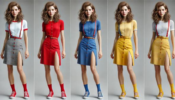
- Tip 2: Using Complementary Colors in Color Theory for Clothes
- Tip 3: Embracing Analogous Colors with Color Theory for Clothes
- Tip 4: Monochromatic Schemes for a Cohesive Look in Color Theory for Clothes
- Tip 5: Seasonal Color Palettes in Color Theory for Clothes
- Tip 6: Flattering Your Skin Tone with Color Theory for Clothes
- Tip 7: Balancing Warm and Cool Colors in Color Theory for Clothes
- Tip 8: Color Psychology in Fashion and Color Theory for Clothes
- Tip 9: Incorporating Patterns and Prints with Color Theory for Clothes
- Tip 10: Accessorizing with Color Theory for Clothes
- Make a Statement with Color Theory for Clothes
- Resources: Free Downloadables
- Quick Facts and FAQ
Ever wondered why some outfits pop while others fall flat? It comes down to color. By mastering a few simple principles of color theoryColor Theory is a comprehensive framework used to understand and analyze the use and interaction of colors in visual compositions. It serves as a critical guide for artists, designers, and marketers, helping them create harmonious and effective designs. This concept encompasses various principles and elements that dictate how colors are combined, perceived, and utilized. Primary Colors: • The three foundational More, you can create looks that catch the eye and reflect your personality. You’ll learn how to mix and match colors, create stunning contrasts, and use color to highlight your best features.
Imagine confidently walking into any room, knowing your outfit is on point. With these tips, you’ll feel more assured in your style decisions.
Let’s dive into the world of color and discover how to make it work for you.
Tip 1: Understanding the Color Wheel for Color Theory for Clothes
The color wheel is a great tool for when you’re looking to improve your fashion sense. It visually represents colors in a circle, showing the relationships between them. The wheel is divided into primary, secondary, and tertiary colorsTertiary colors are the next step in the color mixing hierarchy, created by combining a primary color with a secondary color. These colors add depth and complexity to the color wheel, offering a rich array of hues for artists and designers. Understanding tertiary colors is essential for anyone looking to refine their color theory knowledge and apply it to their More.
- Primary colorsPrimary colors form the foundation of color theory and are essential to understanding how colors work together. The primary colors are red, blue, and yellow. These colors are unique because they cannot be created by mixing other colors together. Instead, they are the source colors that mix to create a broad spectrum of hues used in art, design, and everyday More: Red, blue, and yellow. These are the building blocks.
- Secondary colorsSecondary colors are a fundamental aspect of color theory, created by mixing two primary colors in equal measure. The three secondary colors are green, orange, and purple. These colors expand the palette available to artists and designers, allowing for a broader range of hues and shades in their work. Understanding secondary colors is essential for anyone looking to deepen their More: Green, orange, and purple, created by mixing primary colorsPrimary colors form the foundation of color theory and are essential to understanding how colors work together. The primary colors are red, blue, and yellow. These colors are unique because they cannot be created by mixing other colors together. Instead, they are the source colors that mix to create a broad spectrum of hues used in art, design, and everyday More.
- Tertiary colorsTertiary colors are the next step in the color mixing hierarchy, created by combining a primary color with a secondary color. These colors add depth and complexity to the color wheel, offering a rich array of hues for artists and designers. Understanding tertiary colors is essential for anyone looking to refine their color theory knowledge and apply it to their More: Red-orange, blue-green, and others formed by mixing primary and secondary colorsSecondary colors are a fundamental aspect of color theory, created by mixing two primary colors in equal measure. The three secondary colors are green, orange, and purple. These colors expand the palette available to artists and designers, allowing for a broader range of hues and shades in their work. Understanding secondary colors is essential for anyone looking to deepen their More.
Once you understand the color wheel, it will help you see how colors work together. In fashion, it guides you in creating balanced and appealing outfits. Complementary colors, opposite each other on the wheel, create vibrant looks. Analogous colors, next to each other, offer a more harmonious style.

With the color wheel, you can mix and match clothes to express your style and personality. It helps you avoid clashes and ensures your outfits always look polished. Mastering the color wheel allows you to confidently experiment with colors and elevate your wardrobe.

Tip 2: Using Complementary Colors in Color Theory for Clothes
Complementary colors are pairs of colors that, when combined, create a striking contrast. They sit opposite each other on the color wheel, such as blue and orange. Knowing these pairs helps you craft eye-catching outfits.

When you pair complementary colors, aim for balance. Wear one color as the dominant shade and use the other as an accent. For example, a blue dress can pair with orange accessories for a balanced look. You can also incorporate these combinations in patterns and prints to add visual interest without overwhelming the senses.

Some successful complementary color combinations include:

- Red and green: This classic pairing works well in holiday-themed outfits or everyday wear. Think of a green sweater with red accessories.
- Blue and orange: Perfect for a bold, dynamic look. Pair a blue top with an orange scarf or belt.
- Yellow and purple: Ideal for spring or summer outfits. A yellow sundress with a purple handbag creates a vibrant and stylish appearance.

Experiment with these combinations to find what suits your style. You’ll master complementary colors in no time, and you’ll be able to create outfits that reflect your unique personality.
Tip 3: Embracing Analogous Colors with Color Theory for Clothes
Analogous colors sit next to each other on the color wheel and share a common hueIn color theory, hue is one of the main properties of a color, defining its dominant wavelength. This characteristic determines whether we perceive a color as red, orange, yellow, green, blue, or violet. Understanding hue is essential for artists, designers, and anyone working with color. Defining Hue • Definition: Hue is the degree to which a color can be described More. These colors create a harmonious and cohesive look, making them ideal for putting together stylish outfits. Examples of analogous color schemes include blue, blue-green, and green, or red, red-orange, and orange.
To create harmonious outfits using analogous colors, start with a base color and build your look by adding neighboring hues. This approach ensures your outfit has a unified feel without being too monotonous. For instance, you could pair a green blouse with a blue-green skirt and add accessories in varying shadesIn color theory, a shade is a darker version of a color, created by adding black to the original hue. This concept is essential for artists and designers, as it allows for a range of deeper, more intense tones that can add depth and drama to a composition. Defining Shade A shade results from mixing a pure hue with black. More of green.

Practical advice for incorporating analogous colors into your wardrobe includes:

- Start small: Begin by adding accessories like scarves, shoes, or jewelry in analogous colors to your existing outfits.
- LayeringLayering is a fundamental technique in art that involves building up multiple layers of material to create depth, texture, and complexity in a composition. This approach is used in various art forms, including painting, drawing, digital art, and mixed media. Layering allows artists to add richness and dimension to their work, making it more dynamic and engaging. Defining Layering Layering More: Use layers to mix different shadesIn color theory, a shade is a darker version of a color, created by adding black to the original hue. This concept is essential for artists and designers, as it allows for a range of deeper, more intense tones that can add depth and drama to a composition. Defining Shade A shade results from mixing a pure hue with black. More of analogous colors. A red top with a red-orange cardigan creates depth and interest.
- Patterns: Choose clothing items with patterns that feature analogous colors. This can be an easy way to incorporate multiple shadesIn color theory, a shade is a darker version of a color, created by adding black to the original hue. This concept is essential for artists and designers, as it allows for a range of deeper, more intense tones that can add depth and drama to a composition. Defining Shade A shade results from mixing a pure hue with black. More into a single look.

Experimenting with analogous colors helps you achieve a balanced and stylish wardrobe. It allows for easy color coordination and ensures your outfits look polished.
Tip 4: Monochromatic Schemes for a Cohesive Look in Color Theory for Clothes
Monochromatic color schemes use different shadesIn color theory, a shade is a darker version of a color, created by adding black to the original hue. This concept is essential for artists and designers, as it allows for a range of deeper, more intense tones that can add depth and drama to a composition. Defining Shade A shade results from mixing a pure hue with black. More, tints, and tonesIn color theory, a tone is a version of a color created by adding gray (a mix of black and white) to the original hue. This concept is essential for artists and designers as it allows for a wide range of colors that are neither too dark nor too light, providing versatility in creating depth, mood, and harmony within a More of a single color. This method creates a unified and cohesive look that’s both stylish and sophisticated. Monochromatic outfits are versatile and suit various occasions.

Benefits of Monochromatic Outfits:
- Simplicity: Takes the guesswork out of matching colors.
- Slimming Effect: Creates a sleek appearance by elongating the silhouette.
- Versatility: Easily adapts to different settings, from casual to formal.


Tips for Adding Variety:
- Textures: Combine fabrics like silk, wool, cotton, and leather for added depth.
- Accessories: Use belts, scarves, and jewelry in varying shadesIn color theory, a shade is a darker version of a color, created by adding black to the original hue. This concept is essential for artists and designers, as it allows for a range of deeper, more intense tones that can add depth and drama to a composition. Defining Shade A shade results from mixing a pure hue with black. More of the same color.
- Patterns: Choose subtle patterns in the same color family to enhance visual appeal.

Experiment with monochromatic schemes to achieve a polished, put-together look. You can focus on textures and accessories, as to maintain an engaging style within a single color paletteA color palette refers to a selection of colors used in design and art. It can set the tone, convey emotions, and highlight key elements. color wheel Types of Color Palettes • Monochromatic: Uses variations in lightness and saturation of a single color. Ideal for creating a harmonious and cohesive look. • Analogous: Combines colors that are next to each More.

Tip 5: Seasonal Color Palettes in Color Theory for Clothes
Color theoryColor Theory is a comprehensive framework used to understand and analyze the use and interaction of colors in visual compositions. It serves as a critical guide for artists, designers, and marketers, helping them create harmonious and effective designs. This concept encompasses various principles and elements that dictate how colors are combined, perceived, and utilized. Primary Colors: • The three foundational More changes with the seasons, offering fresh palettes that match the time of year. Align your wardrobe with these palettes to keep your outfits stylish and appropriate.
Spring:
- Soft pastels like mint green, baby blue, lavender, and peach.
- Mint green dress, light pink cardigan, nude flats.

Summer:
- Bright shadesIn color theory, a shade is a darker version of a color, created by adding black to the original hue. This concept is essential for artists and designers, as it allows for a range of deeper, more intense tones that can add depth and drama to a composition. Defining Shade A shade results from mixing a pure hue with black. More such as coral, turquoise, sunflower yellow, and hot pink.
- Coral sundress, turquoise accessories, white sandals.

Fall:
- Warm tonesIn color theory, a tone is a version of a color created by adding gray (a mix of black and white) to the original hue. This concept is essential for artists and designers as it allows for a wide range of colors that are neither too dark nor too light, providing versatility in creating depth, mood, and harmony within a More like burnt orange, deep red, mustard yellow, and olive green.
- Deep red sweater, mustard yellow scarf, olive green pants, brown boots.

Winter:
- Rich colors including emerald green, royal blue, burgundy, and silver.
- Royal blue coat, burgundy scarf, black pants, silver ankle boots.

Seasonal color palettes ensure your wardrobe stays fresh and stylish year-round.
Tip 6: Flattering Your Skin Tone with Color Theory for Clothes
Understanding your skin’s undertone helps you choose colors that enhance your natural look. Skin tonesIn color theory, a tone is a version of a color created by adding gray (a mix of black and white) to the original hue. This concept is essential for artists and designers as it allows for a wide range of colors that are neither too dark nor too light, providing versatility in creating depth, mood, and harmony within a More can be warm, cool, or neutral.
Warm Undertones are characterized by yellow, golden, or peach hues. Earthy shadesIn color theory, a shade is a darker version of a color, created by adding black to the original hue. This concept is essential for artists and designers, as it allows for a range of deeper, more intense tones that can add depth and drama to a composition. Defining Shade A shade results from mixing a pure hue with black. More like olive, brown, ivory, and warm reds complement these undertones well. For example, a mustard yellow top, terracotta dress, or cream blouse will enhance your complexion.

Cool Undertones have pink, red, or blue hues. Jewel tonesIn color theory, a tone is a version of a color created by adding gray (a mix of black and white) to the original hue. This concept is essential for artists and designers as it allows for a wide range of colors that are neither too dark nor too light, providing versatility in creating depth, mood, and harmony within a More such as emerald, sapphire, lavender, and cool blues work best. Think of an emerald green sweater, lavender dress, or navy blue shirt to flatter your skin tone.


Neutral Undertones balance both warm and cool hues. Versatile shadesIn color theory, a shade is a darker version of a color, created by adding black to the original hue. This concept is essential for artists and designers, as it allows for a range of deeper, more intense tones that can add depth and drama to a composition. Defining Shade A shade results from mixing a pure hue with black. More like soft pink, jadeJade, a precious gemstone highly esteemed in various cultures, particularly in East Asia, symbolizes purity, serenity, and longevity. It has been used for thousands of years in art, jewelry, and ritual objects. Types of Jade There are two primary types of jade, each with distinct characteristics and sources. Unworked jade Nephrite • Composition: Composed mainly of calcium, magnesium, and iron. More green, and light peach suit neutral undertones. A soft pink blouse, jadeJade, a precious gemstone highly esteemed in various cultures, particularly in East Asia, symbolizes purity, serenity, and longevity. It has been used for thousands of years in art, jewelry, and ritual objects. Types of Jade There are two primary types of jade, each with distinct characteristics and sources. Unworked jade Nephrite • Composition: Composed mainly of calcium, magnesium, and iron. More green top, or light peach dress can look particularly flattering.

Choosing colors that match your skin tone ensures your outfits always look harmonious and flattering.
Tip 7: Balancing Warm and Cool Colors in Color Theory for Clothes
Warm colors include reds, oranges, and yellows, while cool colors encompass blues, greens, and purples. Balance these tonesIn color theory, a tone is a version of a color created by adding gray (a mix of black and white) to the original hue. This concept is essential for artists and designers as it allows for a wide range of colors that are neither too dark nor too light, providing versatility in creating depth, mood, and harmony within a More in an outfit to create visual harmony and add depth to your style.
To balance warm and cool tonesIn color theory, a tone is a version of a color created by adding gray (a mix of black and white) to the original hue. This concept is essential for artists and designers as it allows for a wide range of colors that are neither too dark nor too light, providing versatility in creating depth, mood, and harmony within a More, start with a dominant color and add accents from the opposite side of the spectrum. For example, if you choose a warm-toned outfit, like a red dress, complement it with cool-toned accessories, such as a blue scarf or green jewelry. Conversely, a blue blouse pairs well with a warm-toned necklace or orange shoes.

Tips for a Well-Rounded Look:
- Use Neutrals: Incorporate neutral colors like white, black, or gray to bridge warm and cool tonesIn color theory, a tone is a version of a color created by adding gray (a mix of black and white) to the original hue. This concept is essential for artists and designers as it allows for a wide range of colors that are neither too dark nor too light, providing versatility in creating depth, mood, and harmony within a More seamlessly.
- LayeringLayering is a fundamental technique in art that involves building up multiple layers of material to create depth, texture, and complexity in a composition. This approach is used in various art forms, including painting, drawing, digital art, and mixed media. Layering allows artists to add richness and dimension to their work, making it more dynamic and engaging. Defining Layering Layering More: Add layers to mix warm and cool tonesIn color theory, a tone is a version of a color created by adding gray (a mix of black and white) to the original hue. This concept is essential for artists and designers as it allows for a wide range of colors that are neither too dark nor too light, providing versatility in creating depth, mood, and harmony within a More, like a warm-toned cardigan over a cool-toned shirt.
- Prints and Patterns: Choose patterns that already combine warm and cool colors to make coordination easier.

When you balance warm and cool colors in your wardrobe, you achieve a well-rounded, visually appealing look that stands out.

Tip 8: Color Psychology in Fashion and Color Theory for Clothes
Colors affect our moods and perceptions. Understanding this can help you dress purposefully for different occasions.
- Red: Conveys confidence and energy. Ideal for making a strong impression at meetings or social events.

- Blue: Evokes calm and trust. Perfect for job interviews or situations requiring clear communication.

- Yellow: Radiates happiness and positivity. Great for casual outings and creative settings.

- Green: Represents balance and growth. Suitable for relaxed environments and outdoor activities.

- Black: Signifies sophistication and power. Best for formal events and creating a sleek look.

- White: Reflects purity and simplicity. Excellent for fresh, clean looks in professional or casual settings.

Practical Examples:
- Confidence Boost: Wear a red dress to a networking event to stand out.
- Calm and Collected: Choose a blue blouse for a job interview to convey trustworthiness.
- Positive Vibes: Opt for a yellow top on a casual day out to spread cheer.
Color psychologyColor psychology examines how colors influence human behavior, emotions, and perceptions. This field combines elements of art, design, and psychology to understand the impact of color on our daily lives. It explores how different hues can evoke specific feelings and responses. Colors play a crucial role in visual communication. They can convey messages, set moods, and even affect decision-making. For More in fashion allows you to tailor your outfits to suit your mood and the occasion, enhancing both your appearance and confidence.
Tip 9: Incorporating Patterns and Prints with Color Theory for Clothes
Color theoryColor Theory is a comprehensive framework used to understand and analyze the use and interaction of colors in visual compositions. It serves as a critical guide for artists, designers, and marketers, helping them create harmonious and effective designs. This concept encompasses various principles and elements that dictate how colors are combined, perceived, and utilized. Primary Colors: • The three foundational More helps choose patterns and prints that create cohesive and stylish outfits. Patterns and prints add interest and personality to your wardrobe.
Tips for Mixing and Matching Prints:
- Start with a Neutral Base: Use neutral colors as a foundation to balance bold patterns.

- Choose Complementary Colors: Patterns with colors opposite on the color wheel create a vibrant look.

- Vary the Scale: Combine large prints with smaller ones to avoid an overwhelming outfit.

- Stick to a Color Scheme: Ensure all patterns share at least one color for harmony.

Examples of Well-Coordinated Patterned Outfits:
- Floral and Stripes: A navy floral blouse with a white and navy striped skirt.
- Polka Dots and Plaid: A red polka dot top with a black and white plaid blazer.
- Animal Print and Solids: A leopard print skirt with a black turtleneck for a balanced look.
Color theoryColor Theory is a comprehensive framework used to understand and analyze the use and interaction of colors in visual compositions. It serves as a critical guide for artists, designers, and marketers, helping them create harmonious and effective designs. This concept encompasses various principles and elements that dictate how colors are combined, perceived, and utilized. Primary Colors: • The three foundational More ensures patterns and prints remain visually appealing and stylish in your outfits.

Tip 10: Accessorizing with Color Theory for Clothes
Accessories enhance an outfit and add personality and a pop of color to your look.
Tips for Using Accessories to Add Pops of Color:
- Start Small: Use scarves, belts, and jewelry for a touch of color.

- Complementary Colors: Pair accessories in colors opposite your outfit’s main color for a vibrant effect.

- Analogous Colors: Choose accessories in colors next to your outfit’s main color on the color wheel for harmony.

Examples of Accessorizing with Color:
- Complementary Colors: A blue dress with orange earrings or a red handbag.
- Analogous Colors: A green blouse with a blue-green necklace or a yellow scarf.
- Neutral Base: A black outfit with a bold red belt or a white dress with a turquoise bracelet.
Use accessories to add color and interest to your outfits, creating a polished and stylish appearance.

Make a Statement with Color Theory for Clothes
Once you’ve mastered color theoryColor Theory is a comprehensive framework used to understand and analyze the use and interaction of colors in visual compositions. It serves as a critical guide for artists, designers, and marketers, helping them create harmonious and effective designs. This concept encompasses various principles and elements that dictate how colors are combined, perceived, and utilized. Primary Colors: • The three foundational More and and you are know about these tips, you’ll create outfits that look great and boost your confidence. Mix patterns, balance warm and cool tonesIn color theory, a tone is a version of a color created by adding gray (a mix of black and white) to the original hue. This concept is essential for artists and designers as it allows for a wide range of colors that are neither too dark nor too light, providing versatility in creating depth, mood, and harmony within a More, and accessorize with vibrant hues. Let your wardrobe become a means for your self-expression.
Step out with confidence, assured that your color choices reflect the best version of you. Your wardrobe will tell your story and showcase the vibrant, stylish you.
Test yourself and see how much you know about color theoryColor Theory is a comprehensive framework used to understand and analyze the use and interaction of colors in visual compositions. It serves as a critical guide for artists, designers, and marketers, helping them create harmonious and effective designs. This concept encompasses various principles and elements that dictate how colors are combined, perceived, and utilized. Primary Colors: • The three foundational More. Take the ultimate color theory quiz here.
Resources: Free Downloadables
Click here for the downloadable color theory quiz PDF.
Click here for the downloadable fun color theory quiz for kids PDF.
Quick Facts and FAQ
Q: What is the color wheel in fashion?
A: The color wheel is a circular diagram of colors used to understand relationships between primary, secondary, and tertiary colorsTertiary colors are the next step in the color mixing hierarchy, created by combining a primary color with a secondary color. These colors add depth and complexity to the color wheel, offering a rich array of hues for artists and designers. Understanding tertiary colors is essential for anyone looking to refine their color theory knowledge and apply it to their More. It helps in creating harmonious color schemes. By using the color wheel, you can easily identify complementary and analogous colors. This knowledge is crucial for designing balanced and visually appealing outfits.
Q: How can I use complementary colors in my wardrobe?
A: Complementary colors are opposite each other on the color wheel, such as blue and orange or red and green. When paired together, they create a vibrant and balanced look. To use complementary colors effectively, choose one color as the dominant hueIn color theory, hue is one of the main properties of a color, defining its dominant wavelength. This characteristic determines whether we perceive a color as red, orange, yellow, green, blue, or violet. Understanding hue is essential for artists, designers, and anyone working with color. Defining Hue • Definition: Hue is the degree to which a color can be described More and the other for accents. This approach ensures that your outfit looks cohesive without being overwhelming.
Q: What are analogous colors and how do I use them?
A: Analogous colors are next to each other on the color wheel, like blue, blue-green, and green. They create a harmonious and pleasing look when used together in an outfit. To use analogous colors, select one color as the main focus and the others for subtle variations. This method adds depth and interest without clashing.
Q: What is a monochromatic color scheme?
A: A monochromatic color scheme involves using different shadesIn color theory, a shade is a darker version of a color, created by adding black to the original hue. This concept is essential for artists and designers, as it allows for a range of deeper, more intense tones that can add depth and drama to a composition. Defining Shade A shade results from mixing a pure hue with black. More, tints, and tonesIn color theory, a tone is a version of a color created by adding gray (a mix of black and white) to the original hue. This concept is essential for artists and designers as it allows for a wide range of colors that are neither too dark nor too light, providing versatility in creating depth, mood, and harmony within a More of a single color. This creates a cohesive and sophisticated look. Adding variety through textures, patterns, and accessories can enhance the visual interest of a monochromatic outfit. This approach simplifies color choices while maintaining elegance.
Q: How do seasonal color palettes work in fashion?
A: Seasonal color palettes change with the seasons, reflecting the natural shifts in light and landscape. Spring colors are often pastel and fresh, while summer favors bright and vibrant hues. Fall brings in warm, earthy tonesIn color theory, a tone is a version of a color created by adding gray (a mix of black and white) to the original hue. This concept is essential for artists and designers as it allows for a wide range of colors that are neither too dark nor too light, providing versatility in creating depth, mood, and harmony within a More, and winter is dominated by cool, rich shadesIn color theory, a shade is a darker version of a color, created by adding black to the original hue. This concept is essential for artists and designers, as it allows for a range of deeper, more intense tones that can add depth and drama to a composition. Defining Shade A shade results from mixing a pure hue with black. More. Adjusting your wardrobe to these palettes can keep your look current and seasonally appropriate.
Q: How can I determine my skin tone for color choices?
A: To determine your skin tone, examine the veins on your wrist; if they appear blue, you have a cool undertone, while green veins indicate a warm undertone. Neutral undertones can wear both warm and cool colors well. Choosing colors that complement your skin tone enhances your natural complexion. This makes your overall appearance more harmonious and flattering.
Q: What are the differences between warm and cool colors?
A: Warm colors, like red, yellow, and orange, evoke warmth and energy. Cool colors, such as blue, green, and purple, convey calmness and serenity. Balancing warm and cool colors in your outfit can create a well-rounded look. Understanding this balance helps in achieving the desired emotional and visual impact.
Q: How does color psychologyColor psychology examines how colors influence human behavior, emotions, and perceptions. This field combines elements of art, design, and psychology to understand the impact of color on our daily lives. It explores how different hues can evoke specific feelings and responses. Colors play a crucial role in visual communication. They can convey messages, set moods, and even affect decision-making. For More influence fashion choices?
A: Color psychologyColor psychology examines how colors influence human behavior, emotions, and perceptions. This field combines elements of art, design, and psychology to understand the impact of color on our daily lives. It explores how different hues can evoke specific feelings and responses. Colors play a crucial role in visual communication. They can convey messages, set moods, and even affect decision-making. For More explores how different colors affect moods and perceptions. For example, blue can create a calming effect, while red may boost confidence and energy. Dressing according to color psychologyColor psychology examines how colors influence human behavior, emotions, and perceptions. This field combines elements of art, design, and psychology to understand the impact of color on our daily lives. It explores how different hues can evoke specific feelings and responses. Colors play a crucial role in visual communication. They can convey messages, set moods, and even affect decision-making. For More allows you to influence how you feel and how others perceive you. This makes your clothing choices more intentional and impactful.
Q: How do I mix patterns and prints using color theoryColor Theory is a comprehensive framework used to understand and analyze the use and interaction of colors in visual compositions. It serves as a critical guide for artists, designers, and marketers, helping them create harmonious and effective designs. This concept encompasses various principles and elements that dictate how colors are combined, perceived, and utilized. Primary Colors: • The three foundational More?
A: Using color theoryColor Theory is a comprehensive framework used to understand and analyze the use and interaction of colors in visual compositions. It serves as a critical guide for artists, designers, and marketers, helping them create harmonious and effective designs. This concept encompasses various principles and elements that dictate how colors are combined, perceived, and utilized. Primary Colors: • The three foundational More to mix patterns and prints involves choosing patterns with at least one common color. This creates a sense of cohesion and prevents clashing. Start with simple combinations and gradually experiment with more complex mixes. Balancing the scale of patterns also helps in maintaining a harmonious look.
Q: How can accessories enhance my use of color in outfits?
A: Accessories are a great way to add pops of color to your outfits without overwhelming the overall look. Choose accessories in complementary or analogous colors to enhance your main color scheme. Items like scarves, jewelry, and bags can subtly incorporate these colors. This approach adds depth and interest to your style while keeping it cohesive.
Q: How can I use color theoryColor Theory is a comprehensive framework used to understand and analyze the use and interaction of colors in visual compositions. It serves as a critical guide for artists, designers, and marketers, helping them create harmonious and effective designs. This concept encompasses various principles and elements that dictate how colors are combined, perceived, and utilized. Primary Colors: • The three foundational More for clothes to create a cohesive wardrobe?
A: Color theoryColor Theory is a comprehensive framework used to understand and analyze the use and interaction of colors in visual compositions. It serves as a critical guide for artists, designers, and marketers, helping them create harmonious and effective designs. This concept encompasses various principles and elements that dictate how colors are combined, perceived, and utilized. Primary Colors: • The three foundational More for clothes involves understanding the relationships between colors and how they can be combined effectively. By using principles like complementary and analogous colors, you can create a wardrobe where pieces mix and match seamlessly. This approach simplifies outfit planning and enhances your overall style. It also ensures your clothes harmonize well together.
Q: What are some color palettes for different seasons?
A: For summer, opt for bright and vibrant hues like turquoise, coral, and sunny yellow. Autumn calls for warm, earthy tonesIn color theory, a tone is a version of a color created by adding gray (a mix of black and white) to the original hue. This concept is essential for artists and designers as it allows for a wide range of colors that are neither too dark nor too light, providing versatility in creating depth, mood, and harmony within a More such as burnt orange, olive green, and mustard. Winter works well with cool, rich colors like deep blue, emerald green, and burgundy. Spring is best complemented by fresh, pastel shadesIn color theory, a shade is a darker version of a color, created by adding black to the original hue. This concept is essential for artists and designers, as it allows for a range of deeper, more intense tones that can add depth and drama to a composition. Defining Shade A shade results from mixing a pure hue with black. More like mint, lavender, and peach.
Q: How can men apply color theoryColor Theory is a comprehensive framework used to understand and analyze the use and interaction of colors in visual compositions. It serves as a critical guide for artists, designers, and marketers, helping them create harmonious and effective designs. This concept encompasses various principles and elements that dictate how colors are combined, perceived, and utilized. Primary Colors: • The three foundational More to their clothing choices?
A: Men can use color theoryColor Theory is a comprehensive framework used to understand and analyze the use and interaction of colors in visual compositions. It serves as a critical guide for artists, designers, and marketers, helping them create harmonious and effective designs. This concept encompasses various principles and elements that dictate how colors are combined, perceived, and utilized. Primary Colors: • The three foundational More to enhance their wardrobe by focusing on complementary and analogous color schemes. Pairing complementary colors like navy and orange can create a striking look, while analogous colors like different shadesIn color theory, a shade is a darker version of a color, created by adding black to the original hue. This concept is essential for artists and designers, as it allows for a range of deeper, more intense tones that can add depth and drama to a composition. Defining Shade A shade results from mixing a pure hue with black. More of blue offer a more harmonious style. Understanding color theoryColor Theory is a comprehensive framework used to understand and analyze the use and interaction of colors in visual compositions. It serves as a critical guide for artists, designers, and marketers, helping them create harmonious and effective designs. This concept encompasses various principles and elements that dictate how colors are combined, perceived, and utilized. Primary Colors: • The three foundational More helps in selecting ties, shirts, and suits that work well together. This knowledge adds sophistication to men’s fashion choices.
Q: What is the importance of a skin tone chart in clothes color theoryColor Theory is a comprehensive framework used to understand and analyze the use and interaction of colors in visual compositions. It serves as a critical guide for artists, designers, and marketers, helping them create harmonious and effective designs. This concept encompasses various principles and elements that dictate how colors are combined, perceived, and utilized. Primary Colors: • The three foundational More?
A: A skin tone chart helps determine whether you have warm, cool, or neutral undertones. This information guides you in selecting colors that enhance your natural complexion. Warm undertones look great in earthy colors, while cool undertones are flattered by jewel tonesIn color theory, a tone is a version of a color created by adding gray (a mix of black and white) to the original hue. This concept is essential for artists and designers as it allows for a wide range of colors that are neither too dark nor too light, providing versatility in creating depth, mood, and harmony within a More. Using a skin tone chart ensures you choose clothes that complement your skin, making you look vibrant and polished.
Q: How do you combine clothes for a summer aesthetic?
A: Combining clothes for a summer aesthetic involves using light, airy fabrics and bright, vibrant colors. Think of pairing whites with pastels, or bold prints with neutral pieces. Accessories like hats and sunglasses can enhance the summer vibe. Light layeringLayering is a fundamental technique in art that involves building up multiple layers of material to create depth, texture, and complexity in a composition. This approach is used in various art forms, including painting, drawing, digital art, and mixed media. Layering allows artists to add richness and dimension to their work, making it more dynamic and engaging. Defining Layering Layering More with breathable fabrics ensures comfort and style during warmer months.
Q: How can I match colors in my outfits for a cohesive look?
A: Matching colors in your outfits involves using a color wheel to understand which colors complement each other. Choose a dominant color and then select secondary colorsSecondary colors are a fundamental aspect of color theory, created by mixing two primary colors in equal measure. The three secondary colors are green, orange, and purple. These colors expand the palette available to artists and designers, allowing for a broader range of hues and shades in their work. Understanding secondary colors is essential for anyone looking to deepen their More that harmonize well. For instance, pair a navy blue jacket with a burgundy shirt and khaki pants. This method ensures your outfit looks intentional and stylish.
Q: How can I use color theoryColor Theory is a comprehensive framework used to understand and analyze the use and interaction of colors in visual compositions. It serves as a critical guide for artists, designers, and marketers, helping them create harmonious and effective designs. This concept encompasses various principles and elements that dictate how colors are combined, perceived, and utilized. Primary Colors: • The three foundational More to combine clothes for autumn?
A: For autumn, combine clothes in warm, rich colors like burnt orange, deep reds, and olive greens. LayeringLayering is a fundamental technique in art that involves building up multiple layers of material to create depth, texture, and complexity in a composition. This approach is used in various art forms, including painting, drawing, digital art, and mixed media. Layering allows artists to add richness and dimension to their work, making it more dynamic and engaging. Defining Layering Layering More is key, so mix different textures and shadesIn color theory, a shade is a darker version of a color, created by adding black to the original hue. This concept is essential for artists and designers, as it allows for a range of deeper, more intense tones that can add depth and drama to a composition. Defining Shade A shade results from mixing a pure hue with black. More to create depth. Use accessories in complementary colors to enhance your look. This approach captures the essence of autumn and keeps your outfits seasonally appropriate.
Q: What are complementary colors and how do they work in fashion?
A: Complementary colors are pairs of colors that are opposite each other on the color wheel, such as blue and orange or red and green. When used together in fashion, they create a vibrant and eye-catching look. To avoid overwhelming your outfit, use one color as the dominant hueIn color theory, hue is one of the main properties of a color, defining its dominant wavelength. This characteristic determines whether we perceive a color as red, orange, yellow, green, blue, or violet. Understanding hue is essential for artists, designers, and anyone working with color. Defining Hue • Definition: Hue is the degree to which a color can be described More and the other for accents. This technique ensures balance and visual interest.
Q: How can I apply color theoryColor Theory is a comprehensive framework used to understand and analyze the use and interaction of colors in visual compositions. It serves as a critical guide for artists, designers, and marketers, helping them create harmonious and effective designs. This concept encompasses various principles and elements that dictate how colors are combined, perceived, and utilized. Primary Colors: • The three foundational More with clothes for a professional setting?
A: In a professional setting, use color theoryColor Theory is a comprehensive framework used to understand and analyze the use and interaction of colors in visual compositions. It serves as a critical guide for artists, designers, and marketers, helping them create harmonious and effective designs. This concept encompasses various principles and elements that dictate how colors are combined, perceived, and utilized. Primary Colors: • The three foundational More to create polished and cohesive outfits. Stick to neutral bases like black, navy, or gray, and add pops of complementary or analogous colors through ties, scarves, or accessories. Monochromatic schemes can also work well for a sleek, modern look. Understanding color theoryColor Theory is a comprehensive framework used to understand and analyze the use and interaction of colors in visual compositions. It serves as a critical guide for artists, designers, and marketers, helping them create harmonious and effective designs. This concept encompasses various principles and elements that dictate how colors are combined, perceived, and utilized. Primary Colors: • The three foundational More helps you project confidence and style in the workplace.
Q: How do you combine clothes for a casual winter look?
A: For a casual winter look, combine clothes in layers using warm, neutral tonesIn color theory, a tone is a version of a color created by adding gray (a mix of black and white) to the original hue. This concept is essential for artists and designers as it allows for a wide range of colors that are neither too dark nor too light, providing versatility in creating depth, mood, and harmony within a More like gray, navy, and black. Add interest with a pop of color, such as a bright scarf or hat. Use textures like wool and knits to add depth to your outfit. This approach ensures you stay warm and stylish.
Q: How can color theoryColor Theory is a comprehensive framework used to understand and analyze the use and interaction of colors in visual compositions. It serves as a critical guide for artists, designers, and marketers, helping them create harmonious and effective designs. This concept encompasses various principles and elements that dictate how colors are combined, perceived, and utilized. Primary Colors: • The three foundational More be applied to hijab fashion?
A: Color theoryColor Theory is a comprehensive framework used to understand and analyze the use and interaction of colors in visual compositions. It serves as a critical guide for artists, designers, and marketers, helping them create harmonious and effective designs. This concept encompasses various principles and elements that dictate how colors are combined, perceived, and utilized. Primary Colors: • The three foundational More in hijab fashion involves selecting hijabs that complement or contrast beautifully with your outfit. Use complementary colors to make a bold statement, or analogous colors for a harmonious look. Consider your skin tone when choosing hijab colors to enhance your natural beauty. This method creates a cohesive and stylish appearance.
Q: What is the best way to combine clothes for a spring wardrobe?
A: Combine clothes for spring by using light, fresh colors such as pastels and florals. Layer lighter fabrics like cotton and linen to adapt to changing weather. Pairing soft pinks, mint greens, and light blues creates a refreshing spring look. Accessories like lightweight scarves and sunglasses can complete your spring ensemble.
Q: How can color theoryColor Theory is a comprehensive framework used to understand and analyze the use and interaction of colors in visual compositions. It serves as a critical guide for artists, designers, and marketers, helping them create harmonious and effective designs. This concept encompasses various principles and elements that dictate how colors are combined, perceived, and utilized. Primary Colors: • The three foundational More improve a capsule wardrobe?
A: Color theoryColor Theory is a comprehensive framework used to understand and analyze the use and interaction of colors in visual compositions. It serves as a critical guide for artists, designers, and marketers, helping them create harmonious and effective designs. This concept encompasses various principles and elements that dictate how colors are combined, perceived, and utilized. Primary Colors: • The three foundational More helps in selecting a cohesive color paletteA color palette refers to a selection of colors used in design and art. It can set the tone, convey emotions, and highlight key elements. color wheel Types of Color Palettes • Monochromatic: Uses variations in lightness and saturation of a single color. Ideal for creating a harmonious and cohesive look. • Analogous: Combines colors that are next to each More for a capsule wardrobe, ensuring all pieces mix and match well. Choose a base of neutral colors and add a few complementary or analogous colors for variety. This approach maximizes outfit combinations and simplifies getting dressed. It also keeps your wardrobe looking coordinated and intentional.
Q: How can I use color theoryColor Theory is a comprehensive framework used to understand and analyze the use and interaction of colors in visual compositions. It serves as a critical guide for artists, designers, and marketers, helping them create harmonious and effective designs. This concept encompasses various principles and elements that dictate how colors are combined, perceived, and utilized. Primary Colors: • The three foundational More to create aesthetic outfits for different seasons?
A: Use color theoryColor Theory is a comprehensive framework used to understand and analyze the use and interaction of colors in visual compositions. It serves as a critical guide for artists, designers, and marketers, helping them create harmonious and effective designs. This concept encompasses various principles and elements that dictate how colors are combined, perceived, and utilized. Primary Colors: • The three foundational More to select color palettes that reflect each season’s mood. For summer, choose vibrant and light colors; for autumn, use warm, earthy tonesIn color theory, a tone is a version of a color created by adding gray (a mix of black and white) to the original hue. This concept is essential for artists and designers as it allows for a wide range of colors that are neither too dark nor too light, providing versatility in creating depth, mood, and harmony within a More. Winter calls for cool, deep colors, and spring works well with pastel shadesIn color theory, a shade is a darker version of a color, created by adding black to the original hue. This concept is essential for artists and designers, as it allows for a range of deeper, more intense tones that can add depth and drama to a composition. Defining Shade A shade results from mixing a pure hue with black. More. Matching your clothes to the seasonal aesthetic ensures a fashionable and season-appropriate look.
Q: How does color theoryColor Theory is a comprehensive framework used to understand and analyze the use and interaction of colors in visual compositions. It serves as a critical guide for artists, designers, and marketers, helping them create harmonious and effective designs. This concept encompasses various principles and elements that dictate how colors are combined, perceived, and utilized. Primary Colors: • The three foundational More affect men’s fashion choices?
A: Color theoryColor Theory is a comprehensive framework used to understand and analyze the use and interaction of colors in visual compositions. It serves as a critical guide for artists, designers, and marketers, helping them create harmonious and effective designs. This concept encompasses various principles and elements that dictate how colors are combined, perceived, and utilized. Primary Colors: • The three foundational More helps men create balanced and stylish outfits by understanding which colors work well together. Complementary colors can make a bold statement, while analogous colors offer a more subtle look. Using these principles in shirts, ties, and suits enhances overall appearance. This knowledge boosts confidence and style.
Q: What are the benefits of using a color matching palette in fashion?
A: A color matching palette helps in selecting colors that harmonize well together. It simplifies the process of creating outfits by providing a visual guide. Using a palette ensures consistency in color choices, making your wardrobe look cohesive. It also helps in mixing and matching clothes more effectively.
Q: How can color theoryColor Theory is a comprehensive framework used to understand and analyze the use and interaction of colors in visual compositions. It serves as a critical guide for artists, designers, and marketers, helping them create harmonious and effective designs. This concept encompasses various principles and elements that dictate how colors are combined, perceived, and utilized. Primary Colors: • The three foundational More be applied to men’s casual outfits?
A: Apply color theoryColor Theory is a comprehensive framework used to understand and analyze the use and interaction of colors in visual compositions. It serves as a critical guide for artists, designers, and marketers, helping them create harmonious and effective designs. This concept encompasses various principles and elements that dictate how colors are combined, perceived, and utilized. Primary Colors: • The three foundational More to men’s casual outfits by choosing complementary or analogous color schemes. For example, pair a blue denim jacket with a rust-colored t-shirt for a complementary look. Analogous colors like navy and green can create a relaxed, harmonious outfit. This approach enhances casual styles with intentional color choices.
Q: How can you combine clothes for a boy’s wardrobe using color theoryColor Theory is a comprehensive framework used to understand and analyze the use and interaction of colors in visual compositions. It serves as a critical guide for artists, designers, and marketers, helping them create harmonious and effective designs. This concept encompasses various principles and elements that dictate how colors are combined, perceived, and utilized. Primary Colors: • The three foundational More?
A: Use color theoryColor Theory is a comprehensive framework used to understand and analyze the use and interaction of colors in visual compositions. It serves as a critical guide for artists, designers, and marketers, helping them create harmonious and effective designs. This concept encompasses various principles and elements that dictate how colors are combined, perceived, and utilized. Primary Colors: • The three foundational More to create a versatile boy’s wardrobe by selecting primary and secondary colorsSecondary colors are a fundamental aspect of color theory, created by mixing two primary colors in equal measure. The three secondary colors are green, orange, and purple. These colors expand the palette available to artists and designers, allowing for a broader range of hues and shades in their work. Understanding secondary colors is essential for anyone looking to deepen their More that mix and match well. Pair bold colors like red and blue with neutral tonesIn color theory, a tone is a version of a color created by adding gray (a mix of black and white) to the original hue. This concept is essential for artists and designers as it allows for a wide range of colors that are neither too dark nor too light, providing versatility in creating depth, mood, and harmony within a More for balance. Incorporate playful patterns that use complementary or analogous colors. This method ensures a practical and stylish wardrobe for boys.
Q: How can color theoryColor Theory is a comprehensive framework used to understand and analyze the use and interaction of colors in visual compositions. It serves as a critical guide for artists, designers, and marketers, helping them create harmonious and effective designs. This concept encompasses various principles and elements that dictate how colors are combined, perceived, and utilized. Primary Colors: • The three foundational More help in choosing clothes for different skin tonesIn color theory, a tone is a version of a color created by adding gray (a mix of black and white) to the original hue. This concept is essential for artists and designers as it allows for a wide range of colors that are neither too dark nor too light, providing versatility in creating depth, mood, and harmony within a More?
A: Color theoryColor Theory is a comprehensive framework used to understand and analyze the use and interaction of colors in visual compositions. It serves as a critical guide for artists, designers, and marketers, helping them create harmonious and effective designs. This concept encompasses various principles and elements that dictate how colors are combined, perceived, and utilized. Primary Colors: • The three foundational More aids in selecting clothes that complement your skin tone, enhancing your overall appearance. Warm undertones look great in earthy and rich colors, while cool undertones are flattered by jewel tonesIn color theory, a tone is a version of a color created by adding gray (a mix of black and white) to the original hue. This concept is essential for artists and designers as it allows for a wide range of colors that are neither too dark nor too light, providing versatility in creating depth, mood, and harmony within a More and icy shadesIn color theory, a shade is a darker version of a color, created by adding black to the original hue. This concept is essential for artists and designers, as it allows for a range of deeper, more intense tones that can add depth and drama to a composition. Defining Shade A shade results from mixing a pure hue with black. More. Neutral undertones can experiment with a wide range of colors. Understanding your skin tone helps you make more flattering fashion choices.
Why not check your artistic color personality? Take the free test here:
My Color Personality Quiz: Artistic Insights for Creatives
You might also enjoy reading the following posts by Pigment Pool:
The History of Color Theory: Must-Know Facts for Creatives
Mastering Art with Color Theory: Kandinsky’s Transformative Vision
Mastering Color Theory: Watercolor Hacks for Vibrant Palettes
Color Theory Simplified: Make Your Art Stand Out with These Easy Tips
Ultimate Guide to the Best Colored Pencils – Must-Know Facts for Hobbyists and Artists
A Brief History of Colour Pigments
This article may contain compensated links. Please read Disclaimer for more info. As an Amazon Associate, I earn from qualifying purchases.