In color theoryColor Theory is a comprehensive framework used to understand and analyze the use and interaction of colors in visual compositions. It serves as a critical guide for artists, designers, and marketers, helping them create harmonious and effective designs. This concept encompasses various principles and elements that dictate how colors are combined, perceived, and utilized. Primary Colors: • The three foundational More, intensity, also known as saturation or chroma, refers to the purity and vividness of a color. This property is essential for artists and designers as it helps create dynamic and engaging visuals. Intensity determines how bright or dull a color appears, influencing the overall impact and mood of a composition.
Defining Intensity
Intensity measures the degree of purity of a color. High-intensity colors are vivid and pure, while low-intensity colors appear more muted or grayish. Adjusting the intensity of a color can significantly change its visual effect and emotional response.
- High Intensity: Colors that are bright and vibrant.
- Low Intensity: Colors that are muted and dull.
- Mid Intensity: Colors that are in between, often appearing less vibrant than pure hues.
Importance of Intensity in Color TheoryColor Theory is a comprehensive framework used to understand and analyze the use and interaction of colors in visual compositions. It serves as a critical guide for artists, designers, and marketers, helping them create harmonious and effective designs. This concept encompasses various principles and elements that dictate how colors are combined, perceived, and utilized. Primary Colors: • The three foundational More
Intensity plays a crucial role in the overall perception of color and is integral to creating a balanced and harmonious composition. It affects how colors interact and how they are perceived by the viewer.
- Visual Impact: High-intensity colors can draw attention and create focal points in a composition.
- Mood and Atmosphere: Different intensities can evoke various emotional responses and set the overall tone of a piece.
- Color Harmony: Adjusting the intensity of colors helps create harmony and balance within a color scheme.
Intensity in Digital and Print Media
Intensity is crucial in both digital and print media, affecting how images and designs are perceived.
- Digital Design: In digital design, intensity is adjusted using software tools that modify the saturation of colors. Designers can create vibrant or subdued visuals depending on the desired effect.
- Print Media: In print, intensity is controlled by the density and purity of inks used. High-intensity colors are achieved with pure, dense inks, while low-intensity colors are created by mixing inks with white or black.
Psychological and Cultural Significance of Intensity
Intensity can carry specific psychological and cultural meanings, influencing how colors are perceived and interpreted.
- Psychological Impact: High-intensity colors are generally perceived as energetic, lively, and exciting. Low-intensity colors can be calming, sophisticated, or somber.
- Cultural Associations: Different cultures may have unique associations with certain intensities. For example, in some cultures, bright red is associated with celebration and vitality, while muted colors may be linked to formality and reserve.

Creating Intensity in Art
Artists manipulate intensity to achieve various effects in their work. Understanding how to adjust the intensity of colors is fundamental for creating dynamic and engaging compositions.
- Mixing Colors: To decrease the intensity of a color, artists often mix it with its complementary color, black, or white. This reduces the purity and makes the color more muted.
- LayeringLayering is a fundamental technique in art that involves building up multiple layers of material to create depth, texture, and complexity in a composition. This approach is used in various art forms, including painting, drawing, digital art, and mixed media. Layering allows artists to add richness and dimension to their work, making it more dynamic and engaging. Defining Layering Layering More: By layeringLayering is a fundamental technique in art that involves building up multiple layers of material to create depth, texture, and complexity in a composition. This approach is used in various art forms, including painting, drawing, digital art, and mixed media. Layering allows artists to add richness and dimension to their work, making it more dynamic and engaging. Defining Layering Layering More colors with different intensities, artists can create depth and interest in their work.
- Contrast: Using high-intensity colors against low-intensity backgrounds can create striking contrasts and highlight specific elements.
Historical Use of Intensity
Throughout art history, intensity has been used to achieve specific effects and convey different moods. Artists have long understood the power of color intensity in their compositions.
- ImpressionismImpressionism was an art movement of the 19th century developed in France, based on the practice of painting spontaneously out-doors (“en plein air”) rather than in the studio. Key impressionist subjects were everyday scenes and landscapes, in which the momentary and transient effects of sunlight should be captured. The artists worked directly in front of their subjects, using rapid brushwork More: Impressionist painters like Vincent van GoghVincent van Gogh (1853 – 1890) is one of the renowned Post-Impressionist artists, best known for his striking use of colour, emphatic brushwork, and contoured forms. As a son of a pastor, the Dutch artist war brought up in a religious and cultured atmosphere. After working unsuccessfully as a clerk at a bookstore, as a salesman, and as a preacher More used high-intensity colors to capture the vibrancy of the natural world and evoke emotional responses.

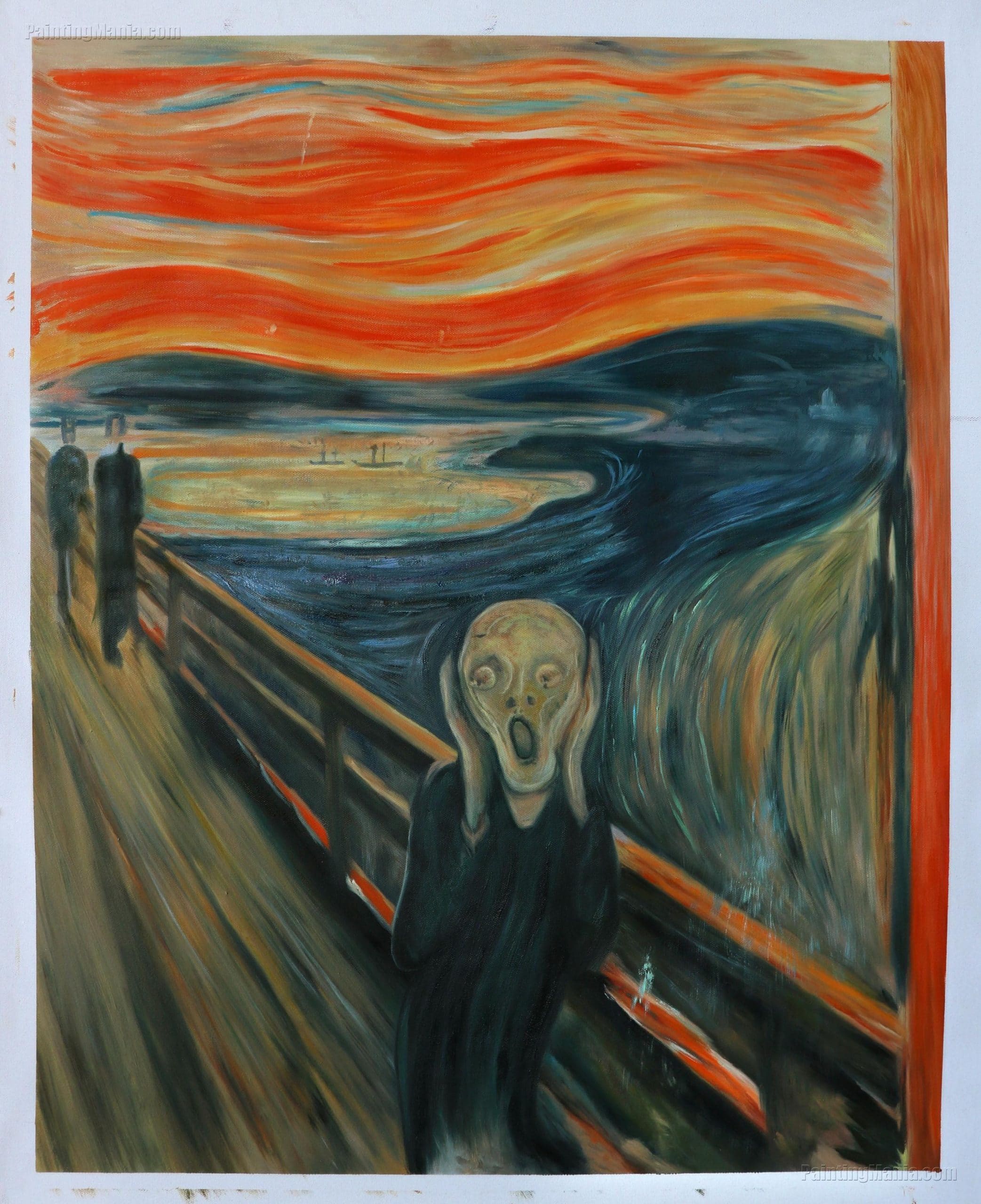
- ExpressionismExpressionism in fine arts was a modernist movement, which originated in Germany in the late 19th and early 20th century. Its roots of can be traced to Post-Impressionist artists like Edvard Munch in Norway, and Gustav Klimt of the Vienna Secession. Core attribute of Expressionism is the tendency to present the world solely from a subjective perspective, distorting objects radically More: Expressionist artists used intense colors to convey strong emotions and dramatic effects, often choosing vivid hues to communicate their inner feelings.

Challenges with Intensity
Working with intensity presents its own set of challenges, particularly in maintaining consistency and achieving the desired effect.
- Intensity Consistency: Ensuring consistent intensity across different mediums and lighting conditions can be difficult. Artists and designers often create color swatches to maintain consistency.
- Overuse of High Intensity: While high-intensity colors can be impactful, overusing them can create a chaotic or overwhelming composition. Balancing high and low intensities is crucial for a harmonious design.
Applications of Intensity in Design
Intensity is widely used in various design fields to create specific visual effects and enhance the overall aesthetic.
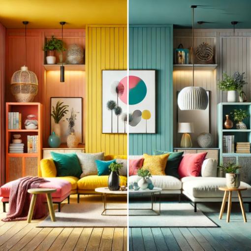
- Interior Design: Intensity plays a key role in interior design, affecting the perception of space and atmosphere. High-intensity colors can energize a space, while low-intensity colors can create a more relaxed and sophisticated environment.
- Graphic Design: In graphic design, intensity helps create visual hierarchy and emphasis. For example, vibrant colors might be used for call-to-action buttons to draw attention.

Intensity vs. ValueIn color theory, value refers to the lightness or darkness of a color. This concept is crucial for artists and designers because it helps create depth, contrast, and visual interest in their work. Value is one of the three properties of color, alongside hue and saturation. Defining Value Value indicates how light or dark a color appears. It ranges from More and HueIn color theory, hue is one of the main properties of a color, defining its dominant wavelength. This characteristic determines whether we perceive a color as red, orange, yellow, green, blue, or violet. Understanding hue is essential for artists, designers, and anyone working with color. Defining Hue • Definition: Hue is the degree to which a color can be described More
It’s important to distinguish between intensity, valueIn color theory, value refers to the lightness or darkness of a color. This concept is crucial for artists and designers because it helps create depth, contrast, and visual interest in their work. Value is one of the three properties of color, alongside hue and saturation. Defining Value Value indicates how light or dark a color appears. It ranges from More, and hueIn color theory, hue is one of the main properties of a color, defining its dominant wavelength. This characteristic determines whether we perceive a color as red, orange, yellow, green, blue, or violet. Understanding hue is essential for artists, designers, and anyone working with color. Defining Hue • Definition: Hue is the degree to which a color can be described More. While intensity refers to the purity of a color, valueIn color theory, value refers to the lightness or darkness of a color. This concept is crucial for artists and designers because it helps create depth, contrast, and visual interest in their work. Value is one of the three properties of color, alongside hue and saturation. Defining Value Value indicates how light or dark a color appears. It ranges from More refers to the lightness or darkness of a color, and hueIn color theory, hue is one of the main properties of a color, defining its dominant wavelength. This characteristic determines whether we perceive a color as red, orange, yellow, green, blue, or violet. Understanding hue is essential for artists, designers, and anyone working with color. Defining Hue • Definition: Hue is the degree to which a color can be described More refers to the color itself.
- Intensity: Measures the purity or vividness of a color.
- ValueIn color theory, value refers to the lightness or darkness of a color. This concept is crucial for artists and designers because it helps create depth, contrast, and visual interest in their work. Value is one of the three properties of color, alongside hue and saturation. Defining Value Value indicates how light or dark a color appears. It ranges from More: Indicates the lightness or darkness of a color.
- HueIn color theory, hue is one of the main properties of a color, defining its dominant wavelength. This characteristic determines whether we perceive a color as red, orange, yellow, green, blue, or violet. Understanding hue is essential for artists, designers, and anyone working with color. Defining Hue • Definition: Hue is the degree to which a color can be described More: Refers to the color (e.g., red, blue, yellow).

Visualizing Intensity
To fully understand the concept of intensity, visual aids such as color wheels, gradient charts, and real-life examples can be helpful.
- Color Wheel with Intensity Levels: A color wheel that includes both high and low-intensity versions of each hueIn color theory, hue is one of the main properties of a color, defining its dominant wavelength. This characteristic determines whether we perceive a color as red, orange, yellow, green, blue, or violet. Understanding hue is essential for artists, designers, and anyone working with color. Defining Hue • Definition: Hue is the degree to which a color can be described More can illustrate how intensity affects color.
- Gradient Charts: These charts display a smooth transition between high and low-intensity colors, helping artists and designers understand gradual changes in purity.
- Real-Life Examples: Photos of objects in various lighting conditions can provide practical insights into how intensity affects perception.
Understanding intensity and its applications allows artists and designers to expand their creative possibilities and enhance their work with a broader range of vibrant and muted colors. This understanding is crucial for creating visually compelling and emotionally resonant compositions.
Read more about color theoryColor Theory is a comprehensive framework used to understand and analyze the use and interaction of colors in visual compositions. It serves as a critical guide for artists, designers, and marketers, helping them create harmonious and effective designs. This concept encompasses various principles and elements that dictate how colors are combined, perceived, and utilized. Primary Colors: • The three foundational More here:
Color Theory Simplified: Make Your Art Stand Out with These Easy Tips
Mastering Color Theory: Watercolor Hacks for Vibrant Palettes
Mastering Art with Color Theory: Kandinsky’s Transformative Vision
