- 1 Who Was Wassily Kandinsky?
- 2 Foundations of Kandinsky’s Color Theory
- 3 Key Elements of Kandinsky’s Color Theory
- 4 Kandinsky’s Influential Works
- 5 Geometrical Shapes and Colors
- 6 Kandinsky’s Legacy in Modern Art
- 7 Practical Application of Kandinsky’s Color Theory
- Kandinsky's Color Theory in Action
- Resources: Free Downloadables
- Sources
- Quick Facts and FAQ
Have you ever felt a surge of energy when surrounded by vibrant reds? Or a sense of calmness when enveloped in cool blues?
Colors affect our emotions and perceptions, shaping our experiences in subtle yet powerful ways. Wassily KandinskyWassily (Vasily) Kandinsky (1866 – 1944) is known as one of the pioneers of abstract modern art. He was born in in Moscow to upper-class parents of mixed ethnic origins. At an early age, Kandinsky showed a rare sensitivity towards music and the arts, which his father strongly supported. Kandinsky decided to study law, ethnography, and economics, and started successfully More, a pioneering artist and theorist, dedicated much of his life to understanding this connection.
Kandinsky’s study of color theoryColor Theory is a comprehensive framework used to understand and analyze the use and interaction of colors in visual compositions. It serves as a critical guide for artists, designers, and marketers, helping them create harmonious and effective designs. This concept encompasses various principles and elements that dictate how colors are combined, perceived, and utilized. Primary Colors: • The three foundational More was deeply personal, driven by his unique perception of the world. He believed that colors could directly affect human emotions, a concept that resonated with his own experiences of synesthesia – a condition where he could hear colors and see sounds.
This idea might sound unusual, but it formed the backbone of his work.
In this post, we’ll explore Kandinsky’s fascinating color theoryColor Theory is a comprehensive framework used to understand and analyze the use and interaction of colors in visual compositions. It serves as a critical guide for artists, designers, and marketers, helping them create harmonious and effective designs. This concept encompasses various principles and elements that dictate how colors are combined, perceived, and utilized. Primary Colors: • The three foundational More. You’ll uncover how his ideas about the emotional and spiritual impact of colors can change how you approach and appreciate art.
1 Who Was Wassily Kandinsky?
Brief Biography
Wassily KandinskyWassily (Vasily) Kandinsky (1866 – 1944) is known as one of the pioneers of abstract modern art. He was born in in Moscow to upper-class parents of mixed ethnic origins. At an early age, Kandinsky showed a rare sensitivity towards music and the arts, which his father strongly supported. Kandinsky decided to study law, ethnography, and economics, and started successfully More was born on December 16, 1866, in Moscow, Russia. Initially, he studied law and economics but shifted his focus to art in his thirties. After moving to Munich in 1896, he began his formal art education and quickly rose to prominence in the art world. Kandinsky is often credited with creating the first purely abstract works, though this view is contested by some art historians.
Kandinsky’s career spanned several decades and continents. He was a founding member of the influential art group Der Blaue Reiter and played an important role in the BauhausThe Bauhaus movement originated as a German school of the arts in the early 20th century. Founded by German architect Walter Gropius in 1919, the school was dedicated to uniting all branches of the arts under one roof. The Bauhaus acted as a hub for Europe's most experimental creatives, with well-known artist instructors like Wassily Kandinsky, Josef Albers, and Paul More movement in Germany. His works and theories have left a lasting impact on modern art, particularly in the realm of abstract art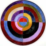 Abstract artworks diverge from depicting recognizable scenes or objects and instead use colors, forms, and lines to create compositions that exist independently of visual references from the natural world. This movement, which gained momentum in the early 20th century, was propelled by artists such as Wassily Kandinsky, Piet Mondrian, and Kazimir Malevich. These artists aimed to explore spiritual, emotional, and More.

Influence and Background
Kandinsky’s background and personal experiences deeply influenced his interest in color theory. He often spoke about experiencing colors in unique ways, suggesting he could hear colors and see sounds. This perspective allowed him to explore the relationship between color and emotion in ways that others couldn’t.
Additionally, Kandinsky’s exposure to various cultural and artistic traditions enriched his understanding of art. His early experiences in Russia, combined with his travels and studies in Europe, helped shape his revolutionary ideas about color and abstraction. His belief that colors had spiritual and emotional qualities became a cornerstone of his work and theories, setting him apart as a visionary in the art world.

2 Foundations of Kandinsky’s Color Theory
Emotional Impact of Colors
Kandinsky believed that colors directly affect human emotions. He argued that colors could evoke specific feelings and moods, making them powerful tools for artists. This idea aligns with Johann Wolfgang von Goethe’s theories, which also linked colors to emotions and psychological states. Both thinkers saw color as a way to connect deeply with the viewer, beyond just visual appeal.
Kandinsky’s approach suggested that colors could communicate complex emotional experiences directly. He saw color as an artist’s language, capable of expressing what words could not. This perspective transformed the use of color in art, encouraging artists to consider the emotional and psychological effects of their palettes. By understanding these effects, artists could create more resonant works.

Synesthesia and Spirituality
Kandinsky often described experiencing colors in unique ways, suggesting he could hear colors and see sounds—a phenomenon known as synesthesia. Synesthesia happens when your brain routes sensory information through multiple unrelated senses, causing you to experience more than one sense simultaneously. Some people taste words or link colors to numbers and letters. It’s not a medical condition, and many people find it useful to help them learn and remember information.
- What it Is: Synesthesia is a phenomenon that causes sensory crossovers, such as tasting colors or feeling sounds. Some people describe it as having “wires crossed” in their brain because it activates two or more senses when there’s only a reason for one sense to activate.
- How it Works: Your brain relies on your five main senses—sight, sound, smell, taste, and touch—to understand the world around you. People with synesthesia experience these senses differently, with their brains processing the same information through two or more sensory pathways at once. This causes a primary effect (the initial sensory experience) and a secondary effect (an additional sensory experience that shouldn’t occur).
Kandinsky’s experiences with synesthesia helped him develop his ideas about the emotional and spiritual qualities of colors. He believed that colors could resonate with the soul, adding a deeper emotional and spiritual dimension to their impact.
His art sought to convey these deeper truths, using color to evoke strong emotional and spiritual responses. Kandinsky’s synesthetic experiences allowed him to paint the world in ways that others could not, giving his work a powerful resonance.

3 Key Elements of Kandinsky’s Color Theory
Kandinsky’s color theoryColor Theory is a comprehensive framework used to understand and analyze the use and interaction of colors in visual compositions. It serves as a critical guide for artists, designers, and marketers, helping them create harmonious and effective designs. This concept encompasses various principles and elements that dictate how colors are combined, perceived, and utilized. Primary Colors: • The three foundational More dives into the specific meanings he assigned to various colors. He believed each color had a distinct emotional and psychological effect. Understanding these color meanings can help you see how Kandinsky used them to create powerful and evocative artworks.

Specific Color Meanings
Kandinsky described yellow as warm and cheeky, with an exciting and energetic quality. He believed it had a disturbing effect, capable of unsettling the viewer. Yellow’s vibrant nature made it feel lively and intense. It often appeared aggressive and could evoke feelings of madness and chaos.
Kandinsky viewed green as the color of peace and stillness. He saw it as calm and passive, offering a sense of tranquility. Green felt restful, providing a soothing break from more intense colors. However, Kandinsky also believed that too much green could become dull and monotonous.
Kandinsky saw blue to be peaceful and deep, evoking a sense of calm and serenity. He described it as a supernatural color, one that could transport you to a tranquil, otherworldly state. The lighter the blue, the more it calmed and soothed. As blue darkened, it felt more profound, almost reaching a spiritual depth that invited introspection and quiet reflection.
Kandinsky described red as a color full of energy and life. He saw it as restless and glowing, embodying a sense of dynamism and vitality. Red felt intense and passionate, evoking strong emotions and excitement. Its vibrant, bold presence made it feel alive, pulsating with warmth and power.
Kandinsky saw orange as a radiant and lively color. He thought it combined the energy of red with the warmth of yellow, creating a sense of health and vibrancy. Orange felt warm and uplifting, bringing a sense of enthusiasm and strength. It was a color that exuded both excitement and vitality.
Kandinsky described violet as a sad and morbid color. As a mix of red and blue, it created a sense of melancholy and introspection. Violet felt extinguished and subdued, often evoking feelings of sorrow and contemplation. It carried a somber tone, reflecting deeper, more introspective emotional states.
White symbolized silence and potential. Kandinsky saw it as a blank slate, full of possibilities and new beginnings. He believed that white could evoke feelings of purity and serenity, creating a peaceful atmosphere. It represented a harmonious silence, the quiet before something new and significant. This sense of untouched potential made white an evocative color in Kandinsky’s palette.
Black represented extinguished light and immovability for Kandinsky. He saw it as the color of great grief, evoking a sense of hopelessness and despair. Black felt heavy and final, like an eternal silence without future or hope. It symbolized the absence of light and life, creating a profound emotional impact in his work.
Kandinsky described grey as the balance between white and black. It symbolized a soundless and motionless state, lacking the energy of other colors. Grey felt neutral and indifferent, often evoking a sense of hopeless stillness. For Kandinsky, grey represented the absence of movement and emotion, creating a dull and lifeless atmosphere.

Color Combinations and Movements
Kandinsky believed that the interaction of colors could create dynamic psychological effects. He studied how colors combined and contrasted to evoke different emotions and responses.

- Complementary Colors: Pairing colors like blue and orange or red and green can create a vibrant contrast. This combination makes each color appear more intense and lively, adding energy and excitement to the artwork.
- Analogous Colors: Using colors that are next to each other on the color wheel, such as blue and green, can produce a harmonious and calming effect. This approach can create a sense of unity and tranquility, making the composition feel more cohesive.
- Warm and Cool Colors: Combining warm colors (like red and yellow) with cool colors (like blue and green) can create a balanced and visually interesting piece. Warm colors tend to advance towards the viewer, creating a feeling of closeness and excitement, while cool colors recede, providing depth and calmness.
- Movement Through Color: Kandinsky also explored how colors could suggest movement. Bright, advancing colors like yellow and red can lead the eye across the canvas, creating a sense of action and flow. Darker, receding colors like blue and black can anchor the composition, providing stability and focus.
By understanding these interactions, you can see how Kandinsky used color to shape the viewer’s emotional and psychological experience in his artworks.

4 Kandinsky’s Influential Works
Kandinsky’s theories on color are best illustrated through his writings and paintings. His book “Concerning the Spiritual in Art” and his notable works offer deep insights into his revolutionary ideas.
“Concerning the Spiritual in Art”
In “Concerning the Spiritual in Art,” written during a time of increasing nihilistic dread and existential anxiety under the encroaching shadow of imminent world war and global upheaval, Kandinsky reflects on the anticipated “spiritual turning-point” in art. He argues that progress in this direction requires conscious effort and responsibility from both artists and viewers.
The Artist’s Task:
- Kandinsky stresses the importance of finding “the principle of the innermost necessity.”
- He believes that artists must use expressive means to achieve the goal of creating a “vibration of the human soul.”
- He uses captivating analogies to discuss the psychology of color and the compositional interrelation of forms.
Kandinsky emphasizes that the viewer’s role is to find purity of perception, moving beyond the mere imitation of nature. He suggests that the beauty of pure color and shape is paramount, as opposed to the stages of impressionismImpressionism was an art movement of the 19th century developed in France, based on the practice of painting spontaneously out-doors (“en plein air”) rather than in the studio. Key impressionist subjects were everyday scenes and landscapes, in which the momentary and transient effects of sunlight should be captured. The artists worked directly in front of their subjects, using rapid brushwork More, expressionismExpressionism in fine arts was a modernist movement, which originated in Germany in the late 19th and early 20th century. Its roots of can be traced to Post-Impressionist artists like Edvard Munch in Norway, and Gustav Klimt of the Vienna Secession. Core attribute of Expressionism is the tendency to present the world solely from a subjective perspective, distorting objects radically More, and cubismSynthetic cubism was the later period of the Cubist art movement generally dated from 1912 – 1919. Artists of Synthetic Cubism moved away from the multi-perspective approach of Analytical Cubism in favour of flattened images that dispensed allusions of the three-dimensional space. Pablo Picasso, Clarinet, Bottle of Bass, Newspaper, Ace of Clubs (2013) The approach of the analytical phase was More, which he views as having been surpassed.
Spiritual Foundations:
- Kandinsky believed that the essence of art lies in its spiritual foundations. He argued that artists should focus on the inner necessity that drives their creativity.
- The task of the artist is not just to replicate nature but to express deeper spiritual truths through their work.
Kandinsky also develops his theories in a later chapter entitled “The Pyramid.” He evokes the great philosophers of the past, presenting the artist as a prophet with the power to transform the future. He writes, “To create a work of art is to create the world,” highlighting the artist’s role in shaping a new spiritual epoch through abstract artAbstract artworks diverge from depicting recognizable scenes or objects and instead use colors, forms, and lines to create compositions that exist independently of visual references from the natural world. This movement, which gained momentum in the early 20th century, was propelled by artists such as Wassily Kandinsky, Piet Mondrian, and Kazimir Malevich. These artists aimed to explore spiritual, emotional, and More.
Kandinsky believed that different arts were converging, each expressing their unique language. He saw this convergence as a step towards a higher spiritual development, where music, paintingPainting is a fundamental form of visual art that has been practiced for thousands of years. It involves applying pigment to a surface such as canvas, paper, or a wall. Painting can be explored through various styles, techniques, and mediums, each offering unique possibilities for expression and creativity. Historical Background • Ancient Beginnings: The history of painting dates back to More, and other forms would work together to elevate human consciousness.
The Role of Music:
- Kandinsky admired music for its ability to express the artist’s soul without relying on natural forms.
- He sought to apply musical methods to paintingPainting is a fundamental form of visual art that has been practiced for thousands of years. It involves applying pigment to a surface such as canvas, paper, or a wall. Painting can be explored through various styles, techniques, and mediums, each offering unique possibilities for expression and creativity. Historical Background • Ancient Beginnings: The history of painting dates back to More, creating rhythm and movement through color and form.
Kandinsky’s vision for the future of art was one of unity and spiritual awakening. He saw abstract artAbstract artworks diverge from depicting recognizable scenes or objects and instead use colors, forms, and lines to create compositions that exist independently of visual references from the natural world. This movement, which gained momentum in the early 20th century, was propelled by artists such as Wassily Kandinsky, Piet Mondrian, and Kazimir Malevich. These artists aimed to explore spiritual, emotional, and More as a powerful tool for artists to communicate directly with the viewer’s inner self, fostering a deeper understanding and appreciation of the spiritual dimensions of life. Writing during an era of global turmoil, he offered a hopeful perspective on the potential of art to uplift and inspire.
Notable Paintings
Kandinsky’s paintings serve as vibrant illustrations of his color theoryColor Theory is a comprehensive framework used to understand and analyze the use and interaction of colors in visual compositions. It serves as a critical guide for artists, designers, and marketers, helping them create harmonious and effective designs. This concept encompasses various principles and elements that dictate how colors are combined, perceived, and utilized. Primary Colors: • The three foundational More. Here are six notable works that exemplify his ideas about color and emotion:
Improvisation 28 (1912)
In “Improvisation 28,” Kandinsky uses bold colors and sweeping lines to evoke a sense of chaos and transformation. The contrast between the fiery reds and soothing blues illustrates his theory that different colors can create tension and harmony within the same piece. This paintingPainting is a fundamental form of visual art that has been practiced for thousands of years. It involves applying pigment to a surface such as canvas, paper, or a wall. Painting can be explored through various styles, techniques, and mediums, each offering unique possibilities for expression and creativity. Historical Background • Ancient Beginnings: The history of painting dates back to More captures the viewer’s attention with its energetic and almost musical rhythm.

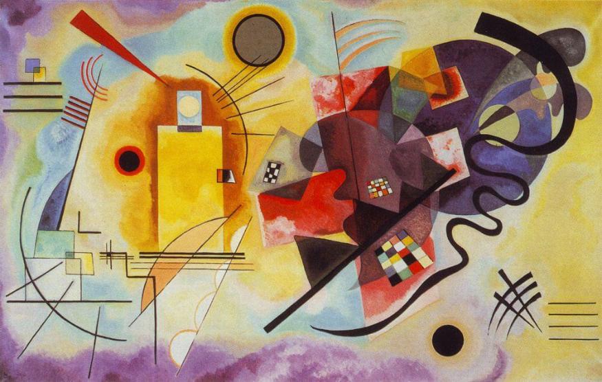
Composition VII (1913)
“Composition VII” is one of Kandinsky’s most complex and celebrated works. This paintingPainting is a fundamental form of visual art that has been practiced for thousands of years. It involves applying pigment to a surface such as canvas, paper, or a wall. Painting can be explored through various styles, techniques, and mediums, each offering unique possibilities for expression and creativity. Historical Background • Ancient Beginnings: The history of painting dates back to More is a riot of color and form, showcasing his belief in the emotional power of abstract artAbstract artworks diverge from depicting recognizable scenes or objects and instead use colors, forms, and lines to create compositions that exist independently of visual references from the natural world. This movement, which gained momentum in the early 20th century, was propelled by artists such as Wassily Kandinsky, Piet Mondrian, and Kazimir Malevich. These artists aimed to explore spiritual, emotional, and More. The interplay of bright yellows, deep blues, and vibrant reds creates a dynamic and energetic composition, drawingDrawing is a foundational art form that involves creating images on a surface, typically paper, using tools such as pencils, pens, and charcoal. It is a versatile medium that allows artists to express ideas, emotions, and stories through lines, shapes, and shading. Historical Background • Prehistoric Beginnings: The earliest known drawings date back to prehistoric times, with cave drawings found More the viewer into a whirlwind of movement and emotion.

Squares with Concentric Circles (1913)
“Squares with Concentric Circles” is an iconic work that vividly illustrates Kandinsky’s fascination with color and shape. The composition consists of multiple squares, each containing concentric circles in varying hues. This piece demonstrates Kandinsky’s exploration of how colors interact within defined shapes, creating a dynamic visual rhythm and emotional resonance.

Composition VIII (1923)
“Composition VIII” marks a return to more structured and geometric forms, compared to his earlier, more chaotic compositions. The use of circles, lines, and color fields shows Kandinsky’s fascination with the emotional resonance of shapes and colors. The balance of cool blues and vibrant yellows in this piece exemplifies his theory of color interaction and its psychological impact.

Yellow-Red-Blue (1925)
“Yellow-Red-Blue” is a demonstration of Kandinsky’s exploration of primary colorsPrimary colors form the foundation of color theory and are essential to understanding how colors work together. The primary colors are red, blue, and yellow. These colors are unique because they cannot be created by mixing other colors together. Instead, they are the source colors that mix to create a broad spectrum of hues used in art, design, and everyday More and their interactions. The paintingPainting is a fundamental form of visual art that has been practiced for thousands of years. It involves applying pigment to a surface such as canvas, paper, or a wall. Painting can be explored through various styles, techniques, and mediums, each offering unique possibilities for expression and creativity. Historical Background • Ancient Beginnings: The history of painting dates back to More features geometric shapes and bold color blocks, emphasizing the psychological effects of color combinations. The juxtaposition of yellow, red, and blue creates a visual dialogue that reflects Kandinsky’s understanding of color dynamics.
Several Circles (1926)
“Several Circles” focuses on the use of simple geometric forms and a limited color paletteA color palette refers to a selection of colors used in design and art. It can set the tone, convey emotions, and highlight key elements. color wheel Types of Color Palettes • Monochromatic: Uses variations in lightness and saturation of a single color. Ideal for creating a harmonious and cohesive look. • Analogous: Combines colors that are next to each More to convey depth and meaning. The overlapping circles in various shadesIn color theory, a shade is a darker version of a color, created by adding black to the original hue. This concept is essential for artists and designers, as it allows for a range of deeper, more intense tones that can add depth and drama to a composition. Defining Shade A shade results from mixing a pure hue with black. More of blue and red create a sense of cosmic harmony and spiritual depth. This paintingPainting is a fundamental form of visual art that has been practiced for thousands of years. It involves applying pigment to a surface such as canvas, paper, or a wall. Painting can be explored through various styles, techniques, and mediums, each offering unique possibilities for expression and creativity. Historical Background • Ancient Beginnings: The history of painting dates back to More highlights Kandinsky’s belief in the power of pure form and color to evoke profound emotional responses.

These works show how Kandinsky used color theoryColor Theory is a comprehensive framework used to understand and analyze the use and interaction of colors in visual compositions. It serves as a critical guide for artists, designers, and marketers, helping them create harmonious and effective designs. This concept encompasses various principles and elements that dictate how colors are combined, perceived, and utilized. Primary Colors: • The three foundational More to translate complex ideas into visually compelling art. Each paintingPainting is a fundamental form of visual art that has been practiced for thousands of years. It involves applying pigment to a surface such as canvas, paper, or a wall. Painting can be explored through various styles, techniques, and mediums, each offering unique possibilities for expression and creativity. Historical Background • Ancient Beginnings: The history of painting dates back to More invites you to experience the emotional and psychological effects of color and form, aligning with Kandinsky’s vision of art as a means to touch the soul.
5 Geometrical Shapes and Colors
Shapes and Colors
Kandinsky believed that geometric shapes and colors had a strong relationship, each shape carrying its own color resonance. He thought that different shapes aligned with specific colors, creating a visual language that conveyed emotional and psychological messages. For example:
- Circles: Paired with blue, evoking feelings of calm and infinity. Kandinsky saw circles as soft and harmonious, reflecting the tranquil and boundless nature of blue.
- Squares: Matched with red, projecting a sense of stability and passion. The solid, balanced form of a square resonated with the strong, vibrant energy of red.
- Triangles: Aligned with yellow, radiating energy and excitement. Triangles, with their sharp points and dynamic lines, perfectly suited the lively and stimulating qualities of yellow.

By combining these shapes and colors, Kandinsky aimed to create compositions that resonated emotionally and psychologically with viewers. He believed that the interplay of form and color could evoke specific responses and communicate deeper meanings.
Angles and Colors
Kandinsky also explored how different angles corresponded to specific colors, using this relationship to enhance the emotional impact of his art. He found that the sharpness or bluntness of an angle could influence the viewer’s perception of color:
- Sharp Angles (like those of a triangle): Best matched with yellow due to their dynamic and energetic nature. The acute angles of a triangle suggested activity and movement, which complemented the vibrant and excitable character of yellow.
- 90-Degree Angles (associated with squares): Corresponded with red, representing strength and balance. The right angles of a square conveyed a sense of solidity and reliability, echoing the powerful presence of red.
- Obtuse Angles: Transitioned into cooler colors like blue, symbolizing calm and serenity. As angles became more obtuse, they lost their aggressive edge, aligning with the peaceful and soothing qualities of blue.
Kandinsky used these relationships to create visual harmony and evoke deeper emotional responses. By carefully considering the interaction of angles and colors, he crafted compositions that appealed to the eye and stirred the soul.

6 Kandinsky’s Legacy in Modern Art
Kandinsky’s pioneering work in color theoryColor Theory is a comprehensive framework used to understand and analyze the use and interaction of colors in visual compositions. It serves as a critical guide for artists, designers, and marketers, helping them create harmonious and effective designs. This concept encompasses various principles and elements that dictate how colors are combined, perceived, and utilized. Primary Colors: • The three foundational More and abstract artAbstract artworks diverge from depicting recognizable scenes or objects and instead use colors, forms, and lines to create compositions that exist independently of visual references from the natural world. This movement, which gained momentum in the early 20th century, was propelled by artists such as Wassily Kandinsky, Piet Mondrian, and Kazimir Malevich. These artists aimed to explore spiritual, emotional, and More has left a lasting impact on modern art. His ideas keep inspiring artists across numerous movements and styles.
Influence on Abstract Art
Kandinsky’s theories laid the groundwork for abstract expressionismThe term Abstract Expressionism is applied to new forms of abstract art developed by American painters such as Mark Rothko, Jackson Pollock, and Willem de Kooning, flourishing between 1943 and the mid-1950s. Since Abstract Expressionism marked the beginning of New York City as the centre of the Western art world, the movement is also known as the New York School. More and other modern art movements. By emphasizing the emotional and spiritual potential of color and form, he opened new possibilities for artistic expression.
His belief in the power of abstract artAbstract artworks diverge from depicting recognizable scenes or objects and instead use colors, forms, and lines to create compositions that exist independently of visual references from the natural world. This movement, which gained momentum in the early 20th century, was propelled by artists such as Wassily Kandinsky, Piet Mondrian, and Kazimir Malevich. These artists aimed to explore spiritual, emotional, and More to communicate deep, inner experiences resonated with many artists who sought to move beyond traditional representational art.
Abstract ExpressionismThe term Abstract Expressionism is applied to new forms of abstract art developed by American painters such as Mark Rothko, Jackson Pollock, and Willem de Kooning, flourishing between 1943 and the mid-1950s. Since Abstract Expressionism marked the beginning of New York City as the centre of the Western art world, the movement is also known as the New York School. More:
- Kandinsky’s focus on the emotional impact of color and form influenced artists like Jackson Pollock and Willem de Kooning.
- These artists embraced his ideas, using spontaneous and dynamic techniques to convey emotion and inner experiences.

Color Field PaintingColor Field Painting emerged in the 1940s and 1950s, primarily in the United States. This style emphasizes large areas of a single color or simple, solid patterns, focusing on the emotional resonance of color itself rather than detailed forms or narratives. Origins and Development Color Field Painting developed from Abstract Expressionism, but it shifted the focus from dynamic brushwork to More:
- Mark Rothko and Barnett NewmanBarnett Newman was a prominent American painter and a key figure in Abstract Expressionism and Color Field Painting. His works are known for their simplicity and spiritual depth, often featuring large, unbroken fields of color intersected by vertical lines he called "zips." Early Life and Career Barnett Newman was born on January 29, 1905, in New York City. He initially More drew inspiration from Kandinsky’s use of color to evoke emotional responses.
- They created large, flat areas of color to immerse viewers in a meditative and emotional experience.

MinimalismMinimalism is an art movement that emerged in the late 1950s and early 1960s, primarily in the United States. It is characterized by its use of simple geometric forms, clean lines, and a focus on the materiality of the work itself. Minimalist art emphasizes simplicity and seeks to strip away any unnecessary elements to reveal the essence of the artwork. More:
- Artists such as Frank StellaFrank Stella is a renowned American artist known for his pioneering work in minimalism and abstract painting. His innovative use of geometric patterns, bold colors, and sculptural forms has left a significant impact on modern art, pushing the boundaries of traditional painting and sculpture. Early Life and Career Frank Stella was born on May 12, 1936, in Malden, Massachusetts. He More and Donald JuddDonald Judd was a leading American artist and critic, known for his significant contributions to minimalism. His work emphasized the importance of the physical space and materiality, pushing the boundaries of traditional sculpture and design. Early Life and Career Donald Judd was born on June 3, 1928, in Excelsior Springs, Missouri. He initially studied philosophy at the College of William More were influenced by Kandinsky’s emphasis on pure form and color.
- They sought to strip art down to its essential elements, focusing on simplicity and directness.
Conceptual ArtConceptual Art emerged in the 1960s as a movement that emphasized ideas and concepts over traditional aesthetic and material concerns. The movement challenges the traditional notion that the artwork must be a physical object, focusing instead on the intellectual engagement of the viewer. Sol Lewitt, Four-Sided Pyramid, 1999 Origins and Development Conceptual Art developed as artists began to question the More:
- Kandinsky’s ideas about the spiritual and psychological dimensions of art paved the way for conceptual artists like Sol LeWittSol LeWitt was an influential American artist whose work helped define both Minimalism and Conceptual Art. Known for his geometric forms, wall drawings, and structures, LeWitt's work emphasized ideas and concepts over the finished product, making him a central figure in 20th-century art. Early Life and Career Sol LeWitt was born on September 9, 1928, in Hartford, Connecticut. He studied More, Yoko OnoYoko Ono is a Japanese multimedia artist, singer, songwriter, and peace activist known for her avant-garde art, performances, and influence on Conceptual Art and Fluxus. Her work often blurs the boundaries between art and life, emphasizing participation, instruction, and the power of imagination. Early Life and Career Yoko Ono was born on February 18, 1933, in Tokyo, Japan. She moved More, and Joseph Kosuth.
- These artists focused on the ideas behind the work, rather than the aesthetic qualities alone.
Op ArtOp Art, short for Optical Art, is a visual art movement that emerged in the 1960s, characterized by the use of geometric patterns, contrasting colors, and optical illusions to create a sense of movement or vibration. This art form plays with visual perception, engaging the viewer in dynamic and sometimes disorienting visual experiences. Origins and Development Op Art gained prominence More:
- Kandinsky’s work with optical effects and color theoryColor Theory is a comprehensive framework used to understand and analyze the use and interaction of colors in visual compositions. It serves as a critical guide for artists, designers, and marketers, helping them create harmonious and effective designs. This concept encompasses various principles and elements that dictate how colors are combined, perceived, and utilized. Primary Colors: • The three foundational More influenced artists like Bridget RileyBridget Riley is a British painter renowned for her contributions to the Op Art movement. Her works are characterized by intricate patterns, vibrant colors, and dynamic optical effects that engage the viewer's perception. Riley's meticulous approach and innovative use of visual elements have made her a key figure in contemporary art. Early Life and Career Bridget Riley was born on More, Victor Vasarely, and Richard AnuszkiewiczRichard Anuszkiewicz was an American painter and sculptor known for his vibrant and meticulous Op Art works. His art focuses on the optical effects of color and form, creating dynamic visual experiences that engage and challenge the viewer’s perception. Richard Anuszkiewicz, Homage to Matisse Early Life and Career Richard Anuszkiewicz was born on May 23, 1930, in Erie, Pennsylvania. He More.
- Op ArtOp Art, short for Optical Art, is a visual art movement that emerged in the 1960s, characterized by the use of geometric patterns, contrasting colors, and optical illusions to create a sense of movement or vibration. This art form plays with visual perception, engaging the viewer in dynamic and sometimes disorienting visual experiences. Origins and Development Op Art gained prominence More relies on optical illusions and the interplay of color and form to create dynamic visual experiences.
Neo-ExpressionismNeo-Expressionism Neo-Expressionism is an art movement that emerged in the late 1970s and early 1980s as a reaction against the conceptual and minimal art that dominated the preceding decade. Characterized by its raw, emotive style, Neo-Expressionism brought back figurative art and emphasized the artist's personal and emotional expression. Origins and Development Neo-Expressionism originated primarily in Germany, Italy, and the United More:
- Artists like Anselm KieferAnselm Kiefer is a German painter and sculptor renowned for his monumental works that explore themes of history, mythology, and the human experience. His art often incorporates a range of materials, including lead, ash, clay, and dried plants, creating rich, textured surfaces that evoke the weight of history and memory. Anselm Kiefer, Faith, Hope, Love Early Life and Career Anselm More and Julian SchnabelJulian Schnabel is an American painter and filmmaker known for his large-scale "plate paintings" and his bold, expressive style. A prominent figure in the Neo-Expressionist movement of the late 20th century, Schnabel's work combines elements of abstraction, figuration, and collage, often incorporating unconventional materials. Early Life and Career Julian Schnabel was born on October 26, 1951, in Brooklyn, New York. More drew on Kandinsky’s emotional and gestural use of color and form.
- Neo-ExpressionismNeo-Expressionism Neo-Expressionism is an art movement that emerged in the late 1970s and early 1980s as a reaction against the conceptual and minimal art that dominated the preceding decade. Characterized by its raw, emotive style, Neo-Expressionism brought back figurative art and emphasized the artist's personal and emotional expression. Origins and Development Neo-Expressionism originated primarily in Germany, Italy, and the United More revived the expressive, emotive style in a contemporary context.
By pushing the boundaries of traditional art, Kandinsky reshaped the landscape of modern art. The innovative use of color and form inspired artists to explore emotional and spiritual dimensions in their own creations. Emphasizing abstraction, Kandinsky encouraged new movements and continues to influence contemporary art.

7 Practical Application of Kandinsky’s Color Theory
Kandinsky’s color theoryColor Theory is a comprehensive framework used to understand and analyze the use and interaction of colors in visual compositions. It serves as a critical guide for artists, designers, and marketers, helping them create harmonious and effective designs. This concept encompasses various principles and elements that dictate how colors are combined, perceived, and utilized. Primary Colors: • The three foundational More offers you valuable insights to deepen your understanding of color and its emotional impact. By applying his principles, you can make your art even more expressive and impactful. Let his ideas help you bring out the emotional depth in your work and connect with your audience on a deeper level.
Tips for Artists
- Understand Emotional Impact: Explore how different colors evoke a whole range of emotions and use this knowledge to enhance the mood of your artwork. Think about how warm colors like red and yellow can create excitement, while cool colors like blue and green can evoke calmness.
- Experiment with Color Combinations: Play around with combining colors to see how they interact. Use complementary colors to create contrast and vibrancy, or analogous colors to create a harmonious and soothing effect.
- Use Shapes to Enhance Color: Pair geometric shapes with specific colors to enhance your compositions. For example, use circles with blue for a calming effect or triangles with yellow to convey energy and excitement.
- Create a Color PaletteA color palette refers to a selection of colors used in design and art. It can set the tone, convey emotions, and highlight key elements. color wheel Types of Color Palettes • Monochromatic: Uses variations in lightness and saturation of a single color. Ideal for creating a harmonious and cohesive look. • Analogous: Combines colors that are next to each More: Develop a color paletteA color palette refers to a selection of colors used in design and art. It can set the tone, convey emotions, and highlight key elements. color wheel Types of Color Palettes • Monochromatic: Uses variations in lightness and saturation of a single color. Ideal for creating a harmonious and cohesive look. • Analogous: Combines colors that are next to each More based on Kandinsky’s principles that resonate with the theme or emotion you want to convey in your artwork.
- Observe and Reflect: After completing a piece, take time to observe how the colors and shapes make you feel. Reflect on the emotional response your work evokes and consider how you can refine your technique.
Color Experiments
To dive deeper into Kandinsky’s color theories, try these exercises and projects:
- Color Journals: Keep a journal where you document your experiments with different color combinations. Note the emotional responses they evoke and how they interact with various shapes.
- Shape and Color Studies: Create a series of small studies that pair specific shapes with their corresponding colors, as suggested by Kandinsky. Observe the psychological effects and how they influence the overall composition.
- Abstract Compositions: Design abstract compositions using Kandinsky’s principles. Focus on the interplay of color and form to convey emotions and spiritual messages. Experiment with different combinations to see what resonates most with you and your audience.
- Daily Color Sketches: Dedicate time each day to create a quick sketch using a new color combination or shape. This practice can help you develop a deeper understanding of how colors and forms work together.
- Themed Projects: Set yourself a project based on a specific emotion or theme, using Kandinsky’s color theories to guide your color and shape choices. This can help you explore how abstract art
%22%20transform%3D%22translate(.5%20.5)%22%20fill-opacity%3D%22.5%22%3E%3Cellipse%20fill%3D%22%23fff%22%20rx%3D%221%22%20ry%3D%221%22%20transform%3D%22rotate(49.5%20-73.5%20216.4)%20scale(22.32723%2041.18916)%22%2F%3E%3Cellipse%20fill%3D%22%2360313a%22%20cx%3D%2272%22%20cy%3D%2276%22%20rx%3D%2261%22%20ry%3D%2261%22%2F%3E%3Cellipse%20fill%3D%22%23fff%22%20rx%3D%221%22%20ry%3D%221%22%20transform%3D%22rotate(-131.7%2070.2%20-26.1)%20scale(108.88858%2017.91884)%22%2F%3E%3Cellipse%20fill%3D%22%23fff%22%20rx%3D%221%22%20ry%3D%221%22%20transform%3D%22rotate(-131.1%2036.5%2066.6)%20scale(60.55413%2017.0478)%22%2F%3E%3C%2Fg%3E%3C%2Fsvg%3E) Abstract artworks diverge from depicting recognizable scenes or objects and instead use colors, forms, and lines to create compositions that exist independently of visual references from the natural world. This movement, which gained momentum in the early 20th century, was propelled by artists such as Wassily Kandinsky, Piet Mondrian, and Kazimir Malevich. These artists aimed to explore spiritual, emotional, and More can convey complex feelings and ideas.
Abstract artworks diverge from depicting recognizable scenes or objects and instead use colors, forms, and lines to create compositions that exist independently of visual references from the natural world. This movement, which gained momentum in the early 20th century, was propelled by artists such as Wassily Kandinsky, Piet Mondrian, and Kazimir Malevich. These artists aimed to explore spiritual, emotional, and More can convey complex feelings and ideas.
By trying these exercises, you’ll get to explore Kandinsky’s color theories in a hands-on way and see how they fit into your own creative process.

Kandinsky’s Color Theory in Action
Kandinsky’s color theoryColor Theory is a comprehensive framework used to understand and analyze the use and interaction of colors in visual compositions. It serves as a critical guide for artists, designers, and marketers, helping them create harmonious and effective designs. This concept encompasses various principles and elements that dictate how colors are combined, perceived, and utilized. Primary Colors: • The three foundational More can bring a new dimension to your art. He believed in the power of colors to touch the human soul, and now you can explore these ideas in your own work.
Art is about experimenting and finding new ways to express yourself, and Kandinsky’s insights provide a great foundation. Take the time to explore his ideas and apply them to your own work. Experiment with different color combinations and shapes. Find new ways to express yourself and make a statement with your work.
Test yourself and see how much you know about color theoryColor Theory is a comprehensive framework used to understand and analyze the use and interaction of colors in visual compositions. It serves as a critical guide for artists, designers, and marketers, helping them create harmonious and effective designs. This concept encompasses various principles and elements that dictate how colors are combined, perceived, and utilized. Primary Colors: • The three foundational More. Take the ultimate color theory quiz here.
Resources: Free Downloadables
Click here for the downloadable color theory quiz PDF.
Click here for the downloadable fun color theory quiz for kids PDF.
Sources
Kandinsky, W. (2020). Concerning the Spiritual in Art"Concerning the Spiritual in Art," written by Wassily Kandinsky in 1910, explores the deep connection between art and spirituality. Kandinsky argues that art should transcend mere representation, aiming to evoke a spiritual response from the viewer. The Essence of Spiritual Art Kandinsky's text is divided into two main parts: a discussion on the history and evolution of art and practical More. Martino Fine Books.
Düchting, H. (2015). Wassily KandinskyWassily (Vasily) Kandinsky (1866 – 1944) is known as one of the pioneers of abstract modern art. He was born in in Moscow to upper-class parents of mixed ethnic origins. At an early age, Kandinsky showed a rare sensitivity towards music and the arts, which his father strongly supported. Kandinsky decided to study law, ethnography, and economics, and started successfully More 1866-1944: A Revolution in PaintingPainting is a fundamental form of visual art that has been practiced for thousands of years. It involves applying pigment to a surface such as canvas, paper, or a wall. Painting can be explored through various styles, techniques, and mediums, each offering unique possibilities for expression and creativity. Historical Background • Ancient Beginnings: The history of painting dates back to More. Taschen.
Lindsay, K. C., & Vergo, P. (Eds.). (1994). Kandinsky: Complete Writings on Art. Da Capo Press.
Kojève, A., & Groys, B. (2023). Kandinsky: Incarnating Beauty. Verso Books.
Sadler, M. T. H. (Trans.). (2020). Concerning the Spiritual in Art"Concerning the Spiritual in Art," written by Wassily Kandinsky in 1910, explores the deep connection between art and spirituality. Kandinsky argues that art should transcend mere representation, aiming to evoke a spiritual response from the viewer. The Essence of Spiritual Art Kandinsky's text is divided into two main parts: a discussion on the history and evolution of art and practical More. Dover Publications.
Guggenheim, S. R. (2021). Vasily Kandinsky: Around the Circle. Guggenheim Museum Publications.
Robinson, M. (2005). Kandinsky (The World’s Greatest Art). Flame Tree Publishing.
Kandinsky, W. (2014). Point and Line to Plane. Martino Fine Books.
Casciato, M., Fox, G., & Rochester, K. (n.d.). Kandinsky Form and Color Exercise. BauhausThe Bauhaus movement originated as a German school of the arts in the early 20th century. Founded by German architect Walter Gropius in 1919, the school was dedicated to uniting all branches of the arts under one roof. The Bauhaus acted as a hub for Europe's most experimental creatives, with well-known artist instructors like Wassily Kandinsky, Josef Albers, and Paul More: Building the New Artist. Retrieved from https://www.getty.edu/research/exhibitions_events/exhibitions/bauhaus/new_artist/form_color/interactive/
Mass Media and Culture. (n.d.). Kandinsky: The master of color, form, and sound. Retrieved from https://massmediandculture.com/kandinsky
Wassily KandinskyWassily (Vasily) Kandinsky (1866 – 1944) is known as one of the pioneers of abstract modern art. He was born in in Moscow to upper-class parents of mixed ethnic origins. At an early age, Kandinsky showed a rare sensitivity towards music and the arts, which his father strongly supported. Kandinsky decided to study law, ethnography, and economics, and started successfully More. (2021, August 10). Color Study. Squares with Concentric Circles, 1913. Retrieved from https://www.wassilykandinsky.net/work-370.php
Britannica. (n.d.). Wassily KandinskyWassily (Vasily) Kandinsky (1866 – 1944) is known as one of the pioneers of abstract modern art. He was born in in Moscow to upper-class parents of mixed ethnic origins. At an early age, Kandinsky showed a rare sensitivity towards music and the arts, which his father strongly supported. Kandinsky decided to study law, ethnography, and economics, and started successfully More – BauhausThe Bauhaus movement originated as a German school of the arts in the early 20th century. Founded by German architect Walter Gropius in 1919, the school was dedicated to uniting all branches of the arts under one roof. The Bauhaus acted as a hub for Europe's most experimental creatives, with well-known artist instructors like Wassily Kandinsky, Josef Albers, and Paul More, Abstract ArtAbstract artworks diverge from depicting recognizable scenes or objects and instead use colors, forms, and lines to create compositions that exist independently of visual references from the natural world. This movement, which gained momentum in the early 20th century, was propelled by artists such as Wassily Kandinsky, Piet Mondrian, and Kazimir Malevich. These artists aimed to explore spiritual, emotional, and More, Color TheoryColor Theory is a comprehensive framework used to understand and analyze the use and interaction of colors in visual compositions. It serves as a critical guide for artists, designers, and marketers, helping them create harmonious and effective designs. This concept encompasses various principles and elements that dictate how colors are combined, perceived, and utilized. Primary Colors: • The three foundational More. Retrieved from https://www.britannica.com/biography/Wassily-Kandinsky
Art Kaleidoscope. (n.d.). Wassily KandinskyWassily (Vasily) Kandinsky (1866 – 1944) is known as one of the pioneers of abstract modern art. He was born in in Moscow to upper-class parents of mixed ethnic origins. At an early age, Kandinsky showed a rare sensitivity towards music and the arts, which his father strongly supported. Kandinsky decided to study law, ethnography, and economics, and started successfully More color theoryColor Theory is a comprehensive framework used to understand and analyze the use and interaction of colors in visual compositions. It serves as a critical guide for artists, designers, and marketers, helping them create harmonious and effective designs. This concept encompasses various principles and elements that dictate how colors are combined, perceived, and utilized. Primary Colors: • The three foundational More. Retrieved from https://vsemart.com/wassily-kandinsky-color-theory/
Denver Art Museum. (n.d.). Wassily Kandinsky’s Symphony of Colors. Retrieved from https://www.denverartmuseum.org/en/blog/wassily-kandinskys-symphony-colors
TheArtStory. (n.d.). Wassily KandinskyWassily (Vasily) Kandinsky (1866 – 1944) is known as one of the pioneers of abstract modern art. He was born in in Moscow to upper-class parents of mixed ethnic origins. At an early age, Kandinsky showed a rare sensitivity towards music and the arts, which his father strongly supported. Kandinsky decided to study law, ethnography, and economics, and started successfully More Paintings, Bio, Ideas. Retrieved from https://www.theartstory.org/artist/kandinsky-wassily/
Sonnets in Colour. (2015, July 10). Kandinsky on the inner meanings of colours. Retrieved from https://sonnetsincolour.org/kandinsky-inner-meanings-colours
Color Meanings. (n.d.). BauhausThe Bauhaus movement originated as a German school of the arts in the early 20th century. Founded by German architect Walter Gropius in 1919, the school was dedicated to uniting all branches of the arts under one roof. The Bauhaus acted as a hub for Europe's most experimental creatives, with well-known artist instructors like Wassily Kandinsky, Josef Albers, and Paul More Color TheoryColor Theory is a comprehensive framework used to understand and analyze the use and interaction of colors in visual compositions. It serves as a critical guide for artists, designers, and marketers, helping them create harmonious and effective designs. This concept encompasses various principles and elements that dictate how colors are combined, perceived, and utilized. Primary Colors: • The three foundational More: Itten, Kandinsky, Albers and Klee. Retrieved from https://www.color-meanings.com/bauhaus-color-theory-itten-kandinsky-albers-klee/
EmeraldPro PaintingPainting is a fundamental form of visual art that has been practiced for thousands of years. It involves applying pigment to a surface such as canvas, paper, or a wall. Painting can be explored through various styles, techniques, and mediums, each offering unique possibilities for expression and creativity. Historical Background • Ancient Beginnings: The history of painting dates back to More. (n.d.). Color TheoryColor Theory is a comprehensive framework used to understand and analyze the use and interaction of colors in visual compositions. It serves as a critical guide for artists, designers, and marketers, helping them create harmonious and effective designs. This concept encompasses various principles and elements that dictate how colors are combined, perceived, and utilized. Primary Colors: • The three foundational More: Wassily KandinskyWassily (Vasily) Kandinsky (1866 – 1944) is known as one of the pioneers of abstract modern art. He was born in in Moscow to upper-class parents of mixed ethnic origins. At an early age, Kandinsky showed a rare sensitivity towards music and the arts, which his father strongly supported. Kandinsky decided to study law, ethnography, and economics, and started successfully More. Retrieved from https://www.emeraldpropainting.com/color-theory-wassily-kandinsky/
Getty Research Institute. (n.d.). Color. BauhausThe Bauhaus movement originated as a German school of the arts in the early 20th century. Founded by German architect Walter Gropius in 1919, the school was dedicated to uniting all branches of the arts under one roof. The Bauhaus acted as a hub for Europe's most experimental creatives, with well-known artist instructors like Wassily Kandinsky, Josef Albers, and Paul More. Retrieved from https://www.getty.edu/research/exhibitions_events/exhibitions/bauhaus/color
PLOS ONE. (n.d.). Color-Shape Associations Revealed with Implicit Association Tests. Retrieved from https://journals.plos.org/plosone/article?id=10.1371/journal.pone.0116954
Hyperallergic. (n.d.). Listening to the Colors in Kandinsky’s Paintings. Retrieved from https://hyperallergic.com/920383/10-art-shows-to-see-in-upstate-new-york-june-2024/
Google Arts & Culture. (n.d.). Vassily Kandinsky, A Pioneer of Abstract ArtAbstract artworks diverge from depicting recognizable scenes or objects and instead use colors, forms, and lines to create compositions that exist independently of visual references from the natural world. This movement, which gained momentum in the early 20th century, was propelled by artists such as Wassily Kandinsky, Piet Mondrian, and Kazimir Malevich. These artists aimed to explore spiritual, emotional, and More. Retrieved from https://artsandculture.google.com/story/vassily-kandinsky-a-pioneer-of-abstract-art
Wikipedia. (n.d.). Wassily KandinskyWassily (Vasily) Kandinsky (1866 – 1944) is known as one of the pioneers of abstract modern art. He was born in in Moscow to upper-class parents of mixed ethnic origins. At an early age, Kandinsky showed a rare sensitivity towards music and the arts, which his father strongly supported. Kandinsky decided to study law, ethnography, and economics, and started successfully More. Retrieved from https://en.wikipedia.org/wiki/Wassily_Kandinsky
The Getty. (n.d.). BauhausThe Bauhaus movement originated as a German school of the arts in the early 20th century. Founded by German architect Walter Gropius in 1919, the school was dedicated to uniting all branches of the arts under one roof. The Bauhaus acted as a hub for Europe's most experimental creatives, with well-known artist instructors like Wassily Kandinsky, Josef Albers, and Paul More Color TheoryColor Theory is a comprehensive framework used to understand and analyze the use and interaction of colors in visual compositions. It serves as a critical guide for artists, designers, and marketers, helping them create harmonious and effective designs. This concept encompasses various principles and elements that dictate how colors are combined, perceived, and utilized. Primary Colors: • The three foundational More: Itten, Kandinsky, Albers and Klee. Retrieved from https://www.getty.edu/research/tools/digital/studies_color_theory.html
Vsemart. (n.d.). Wassily KandinskyWassily (Vasily) Kandinsky (1866 – 1944) is known as one of the pioneers of abstract modern art. He was born in in Moscow to upper-class parents of mixed ethnic origins. At an early age, Kandinsky showed a rare sensitivity towards music and the arts, which his father strongly supported. Kandinsky decided to study law, ethnography, and economics, and started successfully More color theoryColor Theory is a comprehensive framework used to understand and analyze the use and interaction of colors in visual compositions. It serves as a critical guide for artists, designers, and marketers, helping them create harmonious and effective designs. This concept encompasses various principles and elements that dictate how colors are combined, perceived, and utilized. Primary Colors: • The three foundational More. Retrieved from https://vsemart.com/wassily-kandinsky-color-theory/
Mass Media and Culture. (n.d.). Kandinsky: The master of color, form, and sound. Retrieved from https://massmediandculture.com/kandinsky-color-form-sound
Denver Art Museum. (n.d.). Wassily Kandinsky’s Symphony of Colors. Retrieved from https://www.denverartmuseum.org/en/blog/wassily-kandinskys-symphony-colors
Quick Facts and FAQ
Q: What was Kandinsky’s special theory about colors?
A: Kandinsky theorized that colors directly affect human emotions. He believed that each color could evoke specific feelings, with red making someone feel alive and energetic, while blue induced a sense of calm and peace. This theory aligned with Johann Wolfgang von Goethe’s ideas on color and emotion. Kandinsky’s exploration of this concept influenced many aspects of modern art.
Q: Did Kandinsky hear colors?
A: It is theorized that Kandinsky had synesthesia, a condition where one sense is simultaneously perceived by one or more additional senses. He often described colors in terms of sounds and emotions, providing evidence that he might have experienced this phenomenon. His unique sensory experiences deeply influenced his artistic work. Many believe this contributed to his innovative approach to color and form.
Q: How do artists use Kandinsky’s color theoryColor Theory is a comprehensive framework used to understand and analyze the use and interaction of colors in visual compositions. It serves as a critical guide for artists, designers, and marketers, helping them create harmonious and effective designs. This concept encompasses various principles and elements that dictate how colors are combined, perceived, and utilized. Primary Colors: • The three foundational More?
A: Artists use Kandinsky’s color theoryColor Theory is a comprehensive framework used to understand and analyze the use and interaction of colors in visual compositions. It serves as a critical guide for artists, designers, and marketers, helping them create harmonious and effective designs. This concept encompasses various principles and elements that dictate how colors are combined, perceived, and utilized. Primary Colors: • The three foundational More to communicate emotions and moods in their artwork. By understanding the emotional impact of different colors, they can create pieces that evoke specific responses from viewers. This theory also helps artists find effective color combinations and contrasts in their compositions. Kandinsky’s insights continue to inspire and guide contemporary artists in their creative processes.
Q: What are the principles of Kandinsky’s color theoryColor Theory is a comprehensive framework used to understand and analyze the use and interaction of colors in visual compositions. It serves as a critical guide for artists, designers, and marketers, helping them create harmonious and effective designs. This concept encompasses various principles and elements that dictate how colors are combined, perceived, and utilized. Primary Colors: • The three foundational More?
A: Kandinsky’s color theoryColor Theory is a comprehensive framework used to understand and analyze the use and interaction of colors in visual compositions. It serves as a critical guide for artists, designers, and marketers, helping them create harmonious and effective designs. This concept encompasses various principles and elements that dictate how colors are combined, perceived, and utilized. Primary Colors: • The three foundational More operates on the idea that individual colors and combinations can evoke certain feelings and moods. He categorized colors into primary, secondary, and tertiary, each with specific emotional impacts. For example, yellow is seen as warm and exciting, while blue is calm and serene. These principles guide artists in creating emotionally resonant works of art.
Q: What are some famous Kandinsky paintings?
A: Some famous Kandinsky paintings include “Composition VII,” “Improvisation 28,” “Yellow-Red-Blue,” “Composition VIII,” “Several Circles,” and “Squares with Concentric Circles.” These works showcase his innovative use of color and abstract forms. They illustrate his belief in the emotional and spiritual power of art. Each paintingPainting is a fundamental form of visual art that has been practiced for thousands of years. It involves applying pigment to a surface such as canvas, paper, or a wall. Painting can be explored through various styles, techniques, and mediums, each offering unique possibilities for expression and creativity. Historical Background • Ancient Beginnings: The history of painting dates back to More offers a unique glimpse into Kandinsky’s artistic vision and theories.
Q: How did Kandinsky’s background influence his interest in color theoryColor Theory is a comprehensive framework used to understand and analyze the use and interaction of colors in visual compositions. It serves as a critical guide for artists, designers, and marketers, helping them create harmonious and effective designs. This concept encompasses various principles and elements that dictate how colors are combined, perceived, and utilized. Primary Colors: • The three foundational More?
A: Kandinsky’s background in law and economics, combined with his later formal art education in Munich, shaped his analytical approach to art. His experiences and observations, including his potential synesthesia, fueled his fascination with the emotional and psychological effects of color. His move from representational art to abstraction allowed him to explore these effects more freely. This background provided a unique foundation for his groundbreaking theories.
Q: What is synesthesia and how did it relate to Kandinsky’s work?
A: Synesthesia is a condition where one sense triggers another, such as seeing colors when hearing music. Kandinsky reportedly experienced this phenomenon, describing colors in terms of sounds and emotions. This sensory crossover significantly influenced his artistic approach, allowing him to create works that resonate on multiple sensory levels. His art often reflects this blend of visual and auditory experiences.
Q: How did Kandinsky’s color theoryColor Theory is a comprehensive framework used to understand and analyze the use and interaction of colors in visual compositions. It serves as a critical guide for artists, designers, and marketers, helping them create harmonious and effective designs. This concept encompasses various principles and elements that dictate how colors are combined, perceived, and utilized. Primary Colors: • The three foundational More influence modern art movements?
A: Kandinsky’s color theoryColor Theory is a comprehensive framework used to understand and analyze the use and interaction of colors in visual compositions. It serves as a critical guide for artists, designers, and marketers, helping them create harmonious and effective designs. This concept encompasses various principles and elements that dictate how colors are combined, perceived, and utilized. Primary Colors: • The three foundational More laid the groundwork for various modern art movements, including abstract expressionismThe term Abstract Expressionism is applied to new forms of abstract art developed by American painters such as Mark Rothko, Jackson Pollock, and Willem de Kooning, flourishing between 1943 and the mid-1950s. Since Abstract Expressionism marked the beginning of New York City as the centre of the Western art world, the movement is also known as the New York School. More and minimalismMinimalism is an art movement that emerged in the late 1950s and early 1960s, primarily in the United States. It is characterized by its use of simple geometric forms, clean lines, and a focus on the materiality of the work itself. Minimalist art emphasizes simplicity and seeks to strip away any unnecessary elements to reveal the essence of the artwork. More. His emphasis on the emotional and spiritual potential of color and form inspired artists to explore non-representational art. Movements like color field paintingColor Field Painting emerged in the 1940s and 1950s, primarily in the United States. This style emphasizes large areas of a single color or simple, solid patterns, focusing on the emotional resonance of color itself rather than detailed forms or narratives. Origins and Development Color Field Painting developed from Abstract Expressionism, but it shifted the focus from dynamic brushwork to More and Op ArtOp Art, short for Optical Art, is a visual art movement that emerged in the 1960s, characterized by the use of geometric patterns, contrasting colors, and optical illusions to create a sense of movement or vibration. This art form plays with visual perception, engaging the viewer in dynamic and sometimes disorienting visual experiences. Origins and Development Op Art gained prominence More also drew from his ideas, focusing on the interplay of color and viewer perception. Kandinsky’s influence continues to be felt in contemporary art.
Q: Why is “Composition VII” considered one of Kandinsky’s most celebrated works?
A: “Composition VII” is celebrated for its complexity and dynamic use of color and form. It exemplifies Kandinsky’s belief in the emotional power of abstract artAbstract artworks diverge from depicting recognizable scenes or objects and instead use colors, forms, and lines to create compositions that exist independently of visual references from the natural world. This movement, which gained momentum in the early 20th century, was propelled by artists such as Wassily Kandinsky, Piet Mondrian, and Kazimir Malevich. These artists aimed to explore spiritual, emotional, and More, with bright yellows, deep blues, and vibrant reds creating an energetic composition. The paintingPainting is a fundamental form of visual art that has been practiced for thousands of years. It involves applying pigment to a surface such as canvas, paper, or a wall. Painting can be explored through various styles, techniques, and mediums, each offering unique possibilities for expression and creativity. Historical Background • Ancient Beginnings: The history of painting dates back to More draws viewers into a whirlwind of movement and emotion, showcasing Kandinsky’s mastery of his color theoryColor Theory is a comprehensive framework used to understand and analyze the use and interaction of colors in visual compositions. It serves as a critical guide for artists, designers, and marketers, helping them create harmonious and effective designs. This concept encompasses various principles and elements that dictate how colors are combined, perceived, and utilized. Primary Colors: • The three foundational More. Its impact and significance make it a cornerstone of his artistic legacy.
Q: How did Kandinsky’s theories align with those of Johann Wolfgang von GoetheJohann Wolfgang von Goethe (1749–1832 CE) was a German writer, poet, scientist, and philosopher. He is best known for his literary works, but his contributions to the study of color were also groundbreaking and influential. Goethe's approach to color theory differed from the scientific perspective of his time, offering a more human-centered understanding of how we perceive color. His work, More?
A: Both Kandinsky and Johann Wolfgang von GoetheJohann Wolfgang von Goethe (1749–1832 CE) was a German writer, poet, scientist, and philosopher. He is best known for his literary works, but his contributions to the study of color were also groundbreaking and influential. Goethe's approach to color theory differed from the scientific perspective of his time, offering a more human-centered understanding of how we perceive color. His work, More believed in the emotional impact of colors. Goethe’s work in color theoryColor Theory is a comprehensive framework used to understand and analyze the use and interaction of colors in visual compositions. It serves as a critical guide for artists, designers, and marketers, helping them create harmonious and effective designs. This concept encompasses various principles and elements that dictate how colors are combined, perceived, and utilized. Primary Colors: • The three foundational More emphasized how different hues could evoke specific emotions, a concept that resonated with Kandinsky. Kandinsky expanded on these ideas, incorporating them into his artistic practice and theoretical writings. Their shared belief in the psychological effects of color helped shape modern understandings of color theoryColor Theory is a comprehensive framework used to understand and analyze the use and interaction of colors in visual compositions. It serves as a critical guide for artists, designers, and marketers, helping them create harmonious and effective designs. This concept encompasses various principles and elements that dictate how colors are combined, perceived, and utilized. Primary Colors: • The three foundational More.
Q: What are some notable Kandinsky art projects for kids?
A: Notable Kandinsky art projects for kids include creating abstract paintings using his color theoryColor Theory is a comprehensive framework used to understand and analyze the use and interaction of colors in visual compositions. It serves as a critical guide for artists, designers, and marketers, helping them create harmonious and effective designs. This concept encompasses various principles and elements that dictate how colors are combined, perceived, and utilized. Primary Colors: • The three foundational More, making concentric circles inspired by “Squares with Concentric Circles,” and crafting tree art influenced by his use of geometric shapes. These projects help children explore color and form in a fun, interactive way. They can learn about Kandinsky’s techniques while expressing their creativity. These activities are great for introducing kids to abstract artAbstract artworks diverge from depicting recognizable scenes or objects and instead use colors, forms, and lines to create compositions that exist independently of visual references from the natural world. This movement, which gained momentum in the early 20th century, was propelled by artists such as Wassily Kandinsky, Piet Mondrian, and Kazimir Malevich. These artists aimed to explore spiritual, emotional, and More and the emotional impact of colors.
Q: How can I introduce Kandinsky art to kids?
A: Introduce Kandinsky art to kids by starting with his vibrant and colorful works, such as “Squares with Concentric Circles.” Use simple explanations about how he believed colors and shapes could express emotions. Encourage kids to create their own abstract artAbstract artworks diverge from depicting recognizable scenes or objects and instead use colors, forms, and lines to create compositions that exist independently of visual references from the natural world. This movement, which gained momentum in the early 20th century, was propelled by artists such as Wassily Kandinsky, Piet Mondrian, and Kazimir Malevich. These artists aimed to explore spiritual, emotional, and More using bold colors and geometric shapes. Interactive projects and discussions about his paintings can make learning about Kandinsky engaging and fun.
Q: What makes Kandinsky art for kids engaging?
A: Kandinsky art for kids is engaging because of its bright colors, bold shapes, and abstract forms that appeal to their imagination. His paintings offer a great way to introduce children to the concept of expressing emotions through art. Interactive projects like paintingPainting is a fundamental form of visual art that has been practiced for thousands of years. It involves applying pigment to a surface such as canvas, paper, or a wall. Painting can be explored through various styles, techniques, and mediums, each offering unique possibilities for expression and creativity. Historical Background • Ancient Beginnings: The history of painting dates back to More circles or creating colorful abstract pieces help kids connect with his techniques. These activities stimulate creativity and make learning about art enjoyable.
Q: How can kids create Kandinsky circles?
A: Kids can create Kandinsky circles by drawingDrawing is a foundational art form that involves creating images on a surface, typically paper, using tools such as pencils, pens, and charcoal. It is a versatile medium that allows artists to express ideas, emotions, and stories through lines, shapes, and shading. Historical Background • Prehistoric Beginnings: The earliest known drawings date back to prehistoric times, with cave drawings found More concentric circles in different colors, inspired by his paintingPainting is a fundamental form of visual art that has been practiced for thousands of years. It involves applying pigment to a surface such as canvas, paper, or a wall. Painting can be explored through various styles, techniques, and mediums, each offering unique possibilities for expression and creativity. Historical Background • Ancient Beginnings: The history of painting dates back to More “Squares with Concentric Circles.” Start with a large circle and draw smaller circles inside, using various bright colors for each ring. This simple activity helps children understand color harmony and the emotional impact of different hues. It’s a fun and accessible way for kids to explore abstract artAbstract artworks diverge from depicting recognizable scenes or objects and instead use colors, forms, and lines to create compositions that exist independently of visual references from the natural world. This movement, which gained momentum in the early 20th century, was propelled by artists such as Wassily Kandinsky, Piet Mondrian, and Kazimir Malevich. These artists aimed to explore spiritual, emotional, and More.
Q: What is the significance of Kandinsky circles in his art?
A: Kandinsky circles, as seen in works like “Several Circles,” represent his exploration of color and form. He used circles to convey harmony, infinity, and spiritual depth. The use of overlapping and concentric circles creates a dynamic visual experience that engages viewers emotionally and psychologically. These circles are central to understanding Kandinsky’s theories on the emotional power of abstract shapes and colors.
Q: How can Kandinsky art inspire kids?
A: Kandinsky art can inspire kids by showing them that art can be expressive and fun without needing to be realistic. His use of bright colors and bold shapes encourages creativity and experimentation. Kids can learn that their emotions and thoughts can be communicated through abstract forms. Kandinsky’s art opens up a world of artistic possibilities for young minds.
Q: What is a Kandinsky tree and how can kids create one?
A: A Kandinsky tree is an art project inspired by Kandinsky’s use of geometric shapes and vibrant colors. Kids can create one by drawingDrawing is a foundational art form that involves creating images on a surface, typically paper, using tools such as pencils, pens, and charcoal. It is a versatile medium that allows artists to express ideas, emotions, and stories through lines, shapes, and shading. Historical Background • Prehistoric Beginnings: The earliest known drawings date back to prehistoric times, with cave drawings found More a tree trunk and branches, then adding colorful circles and shapes as leaves. This project combines elements of nature with abstract artAbstract artworks diverge from depicting recognizable scenes or objects and instead use colors, forms, and lines to create compositions that exist independently of visual references from the natural world. This movement, which gained momentum in the early 20th century, was propelled by artists such as Wassily Kandinsky, Piet Mondrian, and Kazimir Malevich. These artists aimed to explore spiritual, emotional, and More, allowing children to explore color and form. It’s a fun and creative way to engage with Kandinsky’s artistic principles.
Q: How can artists create Kandinsky inspired art?
A: Artists can create Kandinsky inspired art by using bold colors, geometric shapes, and abstract forms. Start by experimenting with different color combinations to see how they evoke emotions. Incorporate shapes like circles, squares, and triangles, and play with their arrangement and interaction. Focus on expressing feelings and ideas through these elements, staying true to Kandinsky’s belief in the emotional power of art.
You might also enjoy reading the following posts by Pigment Pool:
The History of Color Theory: Must-Know Facts for Creatives
Color Theory Simplified: Make Your Art Stand Out with These Easy Tips
Top 10 Tips on Applying Color Theory for Clothes
Ultimate Guide to the Best Colored Pencils – Must-Know Facts for Hobbyists and Artists
A Brief History of Colour Pigments
Mastering Color Theory: Watercolor Hacks for Vibrant Palettes
The Art of Hanging Art: How to Follow and Break Rules
This article may contain compensated links. Please read Disclaimer for more info. As an Amazon Associate, I earn from qualifying purchases.